
Help & Support
Frax Pro Help
What is Frax Pro?
Frax Pro is already built into the Frax app and is unlocked via an In-App-Purchase (IAP). It enables a whole raft of new features and content to let you take Frax to the next level!
This is the list in general, quite a line-up, and worth making sure you do know about the new bits, because not all of that is really obvious…
So let us take each item one by one and point out all you need to get going.
A few of the most important items up front:
- Tap the logo once to switch between “rooms”
In particular the old Explore has new functions
The new Design is the main place for Pro
The new Shape lets you discover new locations
The Flow room also has new functions
All of these are explained in the pages below… - Double tap the logo as a power short cut
You will toggle back and forth instantly between Explore and Design, without the logo menu. - The logo menu is also where you can get to all future in-app-purchases (IAPs)
- Do not miss the Ultra Resolution Rendering!
It is an exclusive option for Pro in Save/Share (Icon in the upper right corner)
It allows output of 50 megapixel wall size posters at 8192 x 6144 dots - for under 50 cents!
More details below…
Control: the Design Room
Probably the biggest central item in Pro is a whole new “room” called Design.
The initial basic version of Frax was using one screen with those four large buttons:
They are really meant to switch between the gesture sets, as you probably know.
That screen is what we call “Frax Explore” - since what you do there is use the gestures to fly around, exploring the locations in the provided presets, but also to use the shuffle function to build new files by combining from the hundreds of built-in “genes”.
There is a gigantic space of combinations there to explore - but one can only shuffle randomly - hence the name “Explore”. Now comes “Design”!
A simple analogy would be the old toy known as “Mr Potato Head”: where you can stick various eyes, ears and noses on a plastic head shape…:
It is obvious that you can get many combinations, but you are also never escaping that similar look, since you obviously know the various ingredients by heart soon.
So imagine if you can draw ANY kind of nose or eye instead… and if you have a particular combination, if you could just make the ears a bit larger, the eyes a bit wider or the nose a tad longer…
Or in other words: it would be pretty impossible to create a likeness to a known face with just a few fixed settings - you would need the freedom to make very small adjustments to have any hope of coming close to rendering Einstein or the Mona Lisa ;) - and that is the exact difference between just shuffling with Explore - versus Design!
You can have a particular image on the screen - and now you can change anything! Just a little bit!
Like making it a bit brighter, or a little less glossy, or move the light a bit, or make it flatter, or raise the texture up, or turn it monochrome, and on and on…
Parameters: Exclusive Access in Pro!
There are almost 100 parameters and meta controls that you get specific access to, each one with a large slider to change the value… (with many of these functions being accessible only in Frax Pro!)
And for that, you get a whole new “room” to focus on the task of choosing which variable to play with and then letting you do that - that is Design.
Gestures: Edge Sliders!
This is important to realize: the Explore room has now been modified for you as a Frax Pro user!
As you switch between Color, Lights and Texture, you will find that in addition to the normal gestures
 like Swipe, Pinch, etc there are now nine additional new controls:
Along the left, right and top edges of the screen you have hidden sliders called appropriately the Edge Sliders.
They let you control very basic functions absolutely instantly and are a power user tool of the prime importance!
As a quick example, in Color you have the gesture to adjust the Frequency with pinch/spread and the Phase using a swipe - they are recognized as multi-touch gestures in the way your fingers are moving. There is a limit though, to how many of those can be sensibly remembered - and even if it is technically easy to add ‘three finger swipes’ or ‘four finger triple taps’… it becomes just too much to recall without having a cheatsheet next to you ;)
So the Edge Sliders are doing very similar functions such as Saturation, Lightness and Contrast/Blur, but instead of detecting how you touch the screen, they are triggered by where you touch the screen - i.e. the edges - which is invariant and nothing need be remembered at all: as you touch the side or top, the slider pops up instantly and its function is displayed, as a reminder for a couple of seconds - then as you continue to drag your finger around, you will see the effect of that parameter changing, instantly in realtime and without any other UI obscuring any part of the image !
It is smart enough not to get triggered if you are in the middle of any other gesture - in other words: while you pinch to change the Frequency, it does not matter that your fingers may touch the edges…
Only when you start a swipe in those regions will the Edge Sliders pop up. It is really quite simple, only takes a few tries…
Note: due to the purposely hidden nature of these power-user features, it is easy to overlook them!
That would be a great shame - because the Explore room with Edge Sliders is an extremely fast way to make 80% of all tweak adjustments - without any interface whatsoever! And changing between them takes only a fraction of a second!
Here is a separate help page on Edge Sliders…
Do have a peek…
Locations: Tons of new Presets!
In the basic Explore version the only method available to create new images is to use Shuffle, with which you can combine different sets of colors, lights and textures. The most impact though is the actual location in the Mandelbrot or Julia set!
Here you now have a major boost in Pro: the number of built-in custom fine-tuned locations has more than doubled - to 360!
Note: it is worth explaining that using the Shuffle icon on the Motion button is not “just randomly picking a spot”. There are infinitely many of them - and even in the 64 bit limit Frax has to live in for speed, there are literally trillions…
However, given the self similarity and the many areas zooming into empty regions, a truly random value is 99.99+% likely to turn out… just lame!
Consider popping up “just somewhere in the solar system” - the odds of finding even a planet at all are already infinitesimal, mostly you land in black space… But to end up on “an interesting spot worth visiting” like the Eiffel Tower or Grand Canyon is just not going to happen randomly - not within the lifetime of your phone, anyway ;)
So we made manual searches with some extra tools and found lots of unique areas, dense fields, heaps of spirals, double triple quadruple junctions, crooked Mini Mandels and pretty much all the known usual Seahorses and Elephants in the current research vocabulary - plus a few more areas that are simply great in their interplay with the unique Frax textures…
Each Shuffle tap is then flying to one of these hand-picked and tuned locations - and having more of them is quite handy indeed! Experienced Freax will soon “know” the basic set - and be hungry for fresh angles and spots!
It is also important for the “genetic diversity” of the files being uploaded to the Frax Cloud galleries - if there were only a dozen locations lets say, all the users are starting from those same or similar areas and things would just look much to homogenous.
The more genes for all presets, the wider the resulting combination space - there will be more presets for all the “genes”, as we like to think of them in updates soon…
For now, just remember that tapping the Shuffle icon in Explore - or the Shuffle west tab in Design - is choosing from a much larger genepool in Pro!
Locations II: The Shape Room!
And in the same theme, knowing that the location is pretty much the defining factor for each frax, you now have access to a special tool to find them!
In Frax Pro you have a new room, called Shape.
It only has one single reason for living - but that’s quite a big one: finding new Julia Sets!
You can learn a lot about the background and tips how to use the Shape room in their help pages
Tip: use the double-tap gesture instead of pinching, especially in Deep Zoom!
More Colors, Lights and Textures: exact control!
Worth mentioning once more is that in Frax Pro there are now double the number of presets for locations - but the same is true for all the other ‘genes’ defining each image:
- Color: you now have 256 complex gradients
and you can fine-tune the appearance directly
including Lightness, Brightness, Hue, Saturation,
Contrast, Blur, Loops and many more…
All of that is in the new Design room.
Many pages of Color info here. - Lights: there are also 256 light presets for Pro,
more than double, each one hand-tuned.
In the Design room you can now access all the the detailed parameters like 3D light position, and set things like Gloss, Reflection with both shape and rotation, size and shine, etc etc. and for each of the two lights separately…
Pages of Lights info here - Textures: the central engine for the unique look
of Frax has two components being combined,
each of which has a cascading chain of stripes
being modified by ripples, which are modified by
swirls, twist, rake and more…
There are over 500 presets for Frax Pro, and more than three dozen sliders to modify each variable separately in the Design room.
Many pages of Texture info here - Many small details like Shuffle in the Design room being able to shuffle each component separately for Lights and Textures! (So you can keep A and watch how it looks with random new B textures)
- In Color gradients are visually displayed as a strip.
Overall the number of presets skyrockets the combinations by gigantic factors - it will be nearly impossible to shuffle and get the same result, ever.
More Presets: the factory album quadruples!
There are yet more presets - but these are the other kind: not the individual genes for the Colors, Lights and Textures, but the factory installed complete presets of entire scenes.
The initial Frax Explore had 42 such pre-installed setups (each with various animation fx), but now in Pro you have 200 of them!
They are not only interesting just to look at for the animation, they mostly use unique new locations, often custom colors, tweaked textures, strange light combinations - in general lots of example of the gigantic space of possibilities! Especially knowing that you can copy and use each aspect separately! In the album view simply tap and hold on a thumbnail to get the selective loading dialog! Steal just the lights, just the location? Done.
See the Frax Explore help for more help about loading presets.
More Information: 300+ info screens for Pro!
You are actually right in here now - this viewer which now is telling you about the Pro upgrade details, is only a small portion of the general set of information you can reach via the ‘i’ anywhere…
It leads to over 300 screens of the Help manual, ‘Getting Started’, tutorials, tips & tricks, as well as troubleshooting, frequently asked questions and much more such as the intro help videos.
- the pages have well over 100 sample images, illustrations, examples of settings and fx
- even if you think you are beyond reading manuals the famous non RTFM user, give it a shot, although you got this far ;): from any tab combination you can jump in to get the proper context help pages - with many details and tips that are not at all obvious and may help a great deal in getting better results.
- Frax Explore - before Pro - already had Help text, It is in most parts unique and still has info worth knowing… you reach it now when you use the ‘i‘ in the Explore room. You can go to the general Explore Help here
- Frax Design - which is the main room for Frax Pro: using ‘i’ there will get you to the really large set of documents, entering with the current tab function.
More Resolution: Ultra Size
As mentioned briefly above: in Frax Pro you have an exclusive option for output you should not miss!
Already in Frax Explore using the icon in the upper right for Save & Share, there are two icons to create an image file from your current frax as you are seeing it on the screen.
The first one creates a local image in your device, which is the same size as the display, but rendered in better quality with 9x anti-aliasing (which has smoother edges than a live frax).
The finished image is shown on-screen and then saved to your Camera Roll album (where you can view it later using the Photos app).
This is a free built-in rendering function.
The second icon lead to an in-app-purchase (IAP) and requires 99 cents (or equivalent currency for the smallest available payment allowed by Apple).
You may now well ask (indeed, we would… ;)
‘why pay for output, if it already renders for free?’
And the answer is easy: Quality and Size.
The Frax engine in the iPhone or iPad has limited resources and power, and so we created a far more capable version that runs in our Frax Cloud, with faster processors and more memory - able to churn out much larger versions of what’s on your display.
Pro users exclusively can create poster files up to
Ultra size: 8192 x 6144 pixels is over 50 megapixels!
 Ultra quality: 81x anti-aliasing is just super smooth!
Just tap the icon for Cloud Render and follow the screens to choose medium, high or Ultra resolution.
More pages on Save & Share in the Explore help.
Note: as a little bonus with your Pro upgrade you also get a bunch of free render credits to get you started! More info below…
More Cloud: lots of extra features…
Many possibilities exist how to extend the app to more functionality by using the Frax Cloud!
Already all Frax users are able to use the more powerful rendering engine residing on our Amazon based servers in order to generate 3 and 12 megapixel images and for Pro users the full Ultra size. But there are many more ways to use the cloud and we are rolling out these new options one by one.
Already in the first Frax Pro version everyone can upload their best frax files to the galleries online - all one has to do is to use this blue icon and connect to the Frax Cloud services!
Just enter a name (a made up handle, real names are not needed, privacy is a big concern for us) and your email address - to sign-up and login within seconds.
Important: included with your Pro upgrade you are also receiving 80 free render credits!. These will be automatically added to your account when you login and access the high-resolution render page.
In US currency that is about three dollars worth - enough to render up 500 million pixels of Frax images in the cloud! Here is how it works:
- Create your favorite frax as you like,
(every time you upload a frax to the cloud a copy is saved in your 'Shared' album on your device) - Tap Save/Share button then the “High Resolution Cloud Render” icon
- Sign up or log in to your Frax Cloud account if it's your first time
- Choose the size and tap the upload button…
it only takes a few seconds (frax data is only 3Kb) - Wait for an email with the download link to your high resolution frax image…
this can take a few minutes depending on the output size and demand in the Frax Cloud.
You can choose an Ultra size 50 megapixel monster file, that takes 8 of your 80 credits - so you could do it ten times (with ten different fraxes of course)
The render engine in the FraxCloud will generate the image at up to 8192 by 6144 pixels (!) and even with 81x anti-aliasing for smooth edges.
When finished it will email you a link to download the final Jpeg file from any browser (you can also send someone that link, instead of the big file)
Note: depending on how much traffic there is at the same time, it may take a while to receive your link, have a look in your email maybe half an hour later, (small ones are faster, huge ones slower of course)
If you choose High-Resolution 12 Mpx, those take only 4 credits, so you could get 20 of them, and Medium-Resolution at 3 Mpx are 1 credit a piece, so you get 80 of those - or any combination of the sizes until you ate up your credits :)
If you tap the logo, the button at the bottom allows you to refresh your credits as an In-App-Purchase, also with nice quantity discounts…
Tip: in the iOS Settings > Frax there is a slider to add a slight sharpening to the large files, depending if you rather prefer crisp details or buttersmooth.
Note: even the small 3 Mpx image will look better than the ‘seemingly same sized’ iPad retina local output, since FraxCloud engine can use the full 81x oversampling. From an iPhone, the 3 Mpx files are quite a bit better than the free local render.
Tip: Maybe you start with a Medium or HiRes render first - to get to know the whole process, and also to gauge how a huge rendered image can look different than the small screen preview.
It might be best to try the same file in each of the three sizes once, to see how you like it… :)
Back to the Cloud: use the Load icon in the upper left corner - there are various Cloud albums visible:
![]()
Tap one of these to see the best Staff Pick selections of new submissions (“Hot”) or simply the last additions (“New”) or a shuffled set (“Mix”) of all of them - which will be thousands.
Additionally there is the “Find” option to search by user name or frax title…
Note: There are several pages of help on these topics, including Load, on Save & Share and a chapter on the Cloud.
As you tap one of the three cloud album icons, you will see the thumbnails shown much like for the factory or user presets:

But now these are files actually coming in from the Frax Cloud live
Tip: It is preferable to do this with WiFi.
The kicker is of course that every file shown in these albums is not just “the picture”, but the actual frax data that made the picture… - ready to zoom-in, pan, rotate, animate, just as if you had made it yourself!
So Frax Pro users suddenly have a huge set of locations, colors, lights and texture combinations to look at for inspiration - and start new explorations.
And there will be more social connectivity soon…
Ready to Play, dear Pro user!
That should be plenty to get you started with all the new toys… and a few more surprises to find.
- the biggest part is the new Design room
- the old Explore now has the new Edge Sliders definitely try them, a great Pro tool set!
- notice all the new Gene Sets when you use the Shuffle icon on the main buttons! You now have 500 textures (with Style), 360 locations and double the number of Color and Lights!
- definitely spend time checking out the 200 new Factory Presets using the Load icon!
- you can re-read this document in Pro Help, the Table of Contents has a link at the bottom
- if you tap the logo there are the various “rooms”
you can switch between:
Explore - the app as it was before Pro but now with Edge sliders
Design - nested tree with a tab for every item (double tap: instant toggle with Explore)
Shape - realtime and deep-zoom universe map between Mandelbrot and Julia sets
Flow - the continuous background serendipity (iOS > Settings > Frax has some prefs) - And pick a name to log onto the Frax Cloud!
We would love to see you up there and will use that new community for the next generation tools Help with creating your free Frax Cloud account - Do not forget to use your free Credits to render monster files at 8192 by 6144 pixels!
Flow
Flow is an extra “room” inside of Frax and it is not meant to generate and design as much as to present existing saved presets.
It is probably reminiscent of several other related references - an aquarium or screensaver mode, playing quietly as an ever changing background. One could also see it as a visual wallpaper projected at a performance or a club.
Flow is being fed fresh new frax scenes every 20 seconds or so and the key point is: they will then animate automatically, so a continuous moving and morphing image happens ‘all by itself’.
A key aspect though: you can instantly interact with these scenes using all the animation gestures - so as a new image pops up, that means you can fly in, rotate, pan, push the colors, move the lights around and still being fed fresh scenes all the time as well. There is a serendipity aspect of playing while sudden switches happen and all is new...
Several things to note on that:
First: if you ever see anything you really like, it only takes on tap to get the interface up, and the checkmark icon in the lower right says “Yes, I like it let me play with this one for real now!”
This is quite similar to the preset factory and user albums, where you can also go from one to the next to the next, and once you find what you like, the checkmark lets you “take it with you” as you return from the album views to the normal Frax.
Flow has the same left right arrow icons as the Load album view, one tap and you quickly skip to the next image.
Being able to interact via gestures means that the three buttons are needed to access all the possible gestures, Motion, Colors and Lights.
Note: Texture is not included, as those gestures are not animated. The checkmark is in that space.
Tip: the speed of that flowing stream can be adjusted in iOS > Settings > Frax where you have options from 3 to 360 seconds! So either it can change very quickly and barely animate at all, or it can trickle in just once every 6 minutes and then evolve and zoom, taking many hours to go through the built-in presets.
Also: you can change the source of the stream by tapping the icon in the upper left. Initially it uses 25 special Flow presets, (100 in Pro), which have color, lights and motion animation settings, including some very interesting special effects.
After you have seen that set you can also use the Factory presets, 42 (200 in Pro), and then you can also assign your own User folder as the source and create a custom sequence. Note that if there is no animation saved with your preset, Flow will add an automatic slight zoom, pan and rotation mix, but not Colors or Lights (you can switch the button and manually make them move of course)
One tap will bring the interface back, so you can switch the gestures or skip to the next/prev scene. It will gracefully retract all the tabs to reveal the full screen flowing mode again.
Tip: note that the UI elements also work blind if you tap the appropriate spots…! So you can tap in the side centers to skip fast, or the buttons to change from Motion to Coloring without ever even seeing the interface.
Note: Flow is a room by itself, much like Shape. To exit back to the normal Frax operation, you can either use the checkmark icon on the fourth button or tap the logo to use the menu to access other rooms directly.
Tip: If you have a large plasma, LCD or projection screen, you could use AirPlay to watch Flow as a huge backdrop wallpaper with unique effects. Set it to your user folder and make perfect files as you like them… More will happen in this area soon :)
Shape
As part of the Frax Pro there is a special dedicated “tool” called Shape. It has a dedicated purpose:
to find new Julia sets…
This is a very rich source of new shapes and enormously rewarding to spend some time with, but also great fun, with full realtime interactivity…
Basically it consists of two “rooms” the main Mandelbrot set (left) and then once you tap the magnifier, the Deep Zoom mode (right)…

It helps a lot to understand a little bit about the two terms, Mandelbrot and Julia sets, and if you have missed it so far, it is covered in detail on the Mandelbrot/Julia page.
Just to pique your interest: it is not an urban legend but the actual truth that Gaston Julia lost his nose in the 1910s. Have a look…
Jumping right to the crux of How to use Shape:
It all centers on the crosshair, so to speak…
When you first enter Shape you can drag it around like a cursor - and that is the entire point of Shape: you use the fully zoomed-out MSet as a map, and  you can instantly see the matching Julia set for that spot, shown in the center, updated in realtime as you drag the crosshair around.
Dragging while you are watching the Julia change is the idea…
To recap the longer Help section in this regard:
there is a unique Julia set for every point on the Mandelbrot set. In fact the M-Set is really the map of the infinite varieties of Julias - and it is in itself an infinite zoomable map!
What Shape is meant to achieve is to explore this relationship and let you get a feel for the variety of shapes, which is enormous.
The initial Shape room is purposely not letting you zoom at the same time, in order to focus on the general catalog of Julias, an overview as it were.
There are 16 yellow dots which you can tap to get a quick description of some key areas, where one can find particularly rich fields. You can drag right past those spots to explore on your own, or tap on them to read some hints.
It is not always obvious, and sometimes even counter intuitive, what the Julia may look like in certain regions… Have fun with the exploration.
The next step is to use the magnifier ‘+’ icon, which will not only zoom in, but go to ‘an entire room’ dedicated to that task: Deep Zoom.
You will find the exact Julia shape as you had it, zoomed closer in a circle in the upper right corner.
Below it is the Magnifier ‘-’ icon to get back… or tap the Julia itself or the “ok” checkmark, to use it!

Tip: Now for the most important part you should not miss: the crosshair cursor!
In general Frax you are free to fly around anywhere, there is never any “cursor”… so why is the Deep Zoom room different? The point is that you need pixel accurate control, because the shapes are so immensely different even between single pixels on the map, that you really want sub-pixel positioning to explore them.
Obviously with a thick finger tapping on the screen, you are very grossly touching dozens of pixels, no matter how much you try to be accurate, it simply cannot be done. The solution is… the crosshair.
Do not use the pinch and spread gesture to zoom, but instead use the Tap zoom:
double tap with one finger to zoom in,
single tap with two fingers to zoom out.
Here it behaves slightly different:
regardless where you tap: you always will zoom into the exact pixel in the center of the crosshair!
In Deep Zoom the difference in behaviour is this:
you swipe to position underneath the crosshair, which is now fixed in the center of the screen.
Then you can double tap anywhere and it zooms exactly into that pixel, and you can keep tapping, each time you are 3x closer, a dozen taps and you you have a several thousand-fold close-up view of that exact pixel - and the corresponding Julia stays perfectly fixed. Obviously moving the map is now also 1000x more accurate than before…

This way you can see extremely minute detail changes in the Julia sets, as you are swiping the main Mandelbrot below the crosshair.
In other words: zoom way deep in there, what used to be a single pixel is now several screens wide, and the same distance swiped covers only a tiny fraction of the distance on the map.
Once you get used to the workflow it is enormously precise and therefore very effective in the search for unique tiny spots of beauty. To recap:
• In the initial Shape room, drag the cursor along the edges of the Mandelbrot set and watch the Julias change in the center. No zoom.
• When you find something peculiar or interesting, use the + magnifier icon to transition to Deep Zoom
• There you drag the Mandelbrot image to position it underneath the crosshair cursor, then double tap to zoom into that exact pixel. At the deeper levels, continue dragging around to see the Julia details.
Tip: it is important to realize that the MSet is in a way a three dimensional map, in that you can zoom in depth. If you are wondering what is down there…
One nice detail that explains it is to make a nested Julia set:
The top picture shows that at the tip of the little nub end the Julia has 4-fold symmetries.
If you then zoom in, you know that you can find MiniMandel sets abundantly all over the place…
So moving to the same nub tip on a MiniMandel - you find four fold Julias again - but look how it is now surrounded with stuff!
The resulting Julia shown for this location is extremely chaotic: within just a couple of pixels on the Mset map, in any direction, one would get drastically different Julia sets.
The double tap zoom into the crosshair is probably best way to multiply resolution - but there is one more tool in Shape that helps here: Tilt!
 It may sound unexpected at first - but swiping by finger is just a bit too coarse for this task. If you tap the Tilt icon you can then move very smoothly - especially in the Deep Zoom mode, it will drag the entire Mset map below the crosshair cursor in an exaggerated slow movement (it is about 4x finer control than normal Tilting is set for!)
Note: you do not have to hold the device horizontally level (like Labyrinth type games), but as you enter Tilt mode in any position: that is set to ‘normal’, detecting further changes from there.
While we are talking about the icons, the Ok Cancel ones are pretty self explanatory: using the Checkmark for OK will accept your current Julia set as the new Frax location (it keeps your previous style…), Cancel reverts back to before.
One more icon is in the lower left corner - it shows the basic Mandelbrot set:
 Since Shape generates special Julia locations, you always exit with… a Julia. That means if you are already on a Julia, even if you exit Shape via cancelling, you get a Julia either way…
So we provided a simple way to get back to the Mandelbrots: this icon acts as a reset and exits directly to the normal zoomed out MSet (of course you could also choose mandelly presets).
In general, the Mset is ultimately more unusual and varied - all Julias are center symmetric, and you can never find such things as MiniMandels there.
However, with the special Shape tool, one can just identify interesting unique shapes so nicely, that it is definitely worth getting used to it.
Overall, both have their place in Frax, but the idea was to make sure you do not end up do nothing BUT Julias from here on out - the Mandels usually have much deeper zoom ranges and are faster, too.
Many websites exist - and many books were written - about the special features to find within both Mandel and Julia - as they are inextricably linked. There is the valley of the seahorses, and the elephant valley, double spirals, triple spirals, and many more. If you get into the spirit of becoming a real explorer, you can find a great deal… and we will provide more as well.
The descriptions of the 16 preset dots is a good start, and before delving into what others say, just go ahead and zoom and pan!
You can also examine the factory presets: go to Shape from there! :)
The User Interface of Frax
Some thoughts on the philosophy
and a few bits of the history
Note: This is not one of the quick help chapters, explaining ‘a few buttons and a couple of tricks’.
If your attention span is limited to 140 characters or you have a particular fear of depth, just skip it…
Paraphrasing Albert, “we’d like to explain things as simply as possible - but not simpler…”
Many of these topics are simply… complicated.
But then, some of you will enjoy following the reasoning, getting a bit of background and a little anecdote here and there to make the whole process a little more real and tangible.
User Interface
Just so we are all on the same page here - user interface, is the term used for “all the buttons and menus and dialogs and sliders etc etc” in software. iOS has done a wonderful job with that, simplifying most tasks on phones and tablets.
Frax uses many of those system-standard solutions - but it quite obviously also employs a number of rather non-standard new concepts, required by the unique features of the app.
From the very start two fundamental aims of the app were:
- Realtime interaction
with as many parameters as possible - Obscuring as little of the image as possible
and what that actually means is….
- Removing the entire interface, as soon and as often as possible
Which is easily said, but not a trivial thing to do. Let’s have a closer look at what is meant by it and which method’s Frax uses to achieve that goal.
Different Use Cases: Explore vs Design
There is a natural distinction to be made between two distinctly different kinds of users.
Casual: First there are the majority “just want to check it out and dabble” casual users.
They are quite happy to poke around a little and after a fairly short time… just go on to the next app. It is a fun diversion and no more.
Experienced: That is “the other group” of users…
The ones that first started just "poking around", but then got more into it, had more fun, are somehow attracted to the exploring or have a natural affinity for graphics, design or maybe the scientific visualization aspect - or are actual fractal fans.
So for that second set of core Frax afficionados - and admittedly also just for ourselves ;) - we wanted to pull out all the stops and take this to the limit.
The difference between these two types is massive:
• what makes sense for the quick dabbler, a simple interface and tools with instant gratification…
…is totally not using all the possibilities though.
• while getting to all the functions properly, for the more interested and experienced users…
…is complete overkill for the causal users.
The problem is having access to the full set of controls and every variable could become a burden instead of a feature.
The solution we liked best in the end was to attempt to serve each case properly by splitting the app itself into two:
Frax Explore: the simple starter app that focuses on the act of exploring - finding new locations by flying around, and using the concept of shuffling to randomly combine known-good “gene sets” to a huge number of possible images.
It has a very simple interface with just four main buttons.
Frax Pro: taking every aspect to its maximum possible state - access to each parameter directly, extra "rooms", features and effects, and a hugely expanded set of gene pool presets.
It has a more complex interface, by definition, in order to deal with almost 100 controls precisely.
Over the course of more than two years it evolved into a very large set of functions and features, and while we initially assumed each new step to be a possible add-on to the basic Explore version, we made another principle decision: to have only one singular upgrade to the Frax Pro level, which then includes all the new bits at once.
The Explore Interface
As outlined in the beginning - the experience of using Frax Explore is all about the multi-touch gestures - without any interface visible during the actual act of playfully discovering new things.
The basic mechanism here is: as soon as the fingers touch the screen, the UI will vanish and you can choose to swipe, pinch, spread, etc…
As you let go, or with a single tap, the interface will come back up to let you change to something else.
The fact that there are multiple sets of gestures is what led to "the four main buttons" to switch between them quickly.
Additionally there is basic household functionality for both versions - like saving and sharing, loading existing presets and user files, as well as Undo/Redo and access to the information and help - like this ;)
In keeping with our fundamental aim of obscuring the image as little as possible, if you simply do nothing to the app…
- after a few seconds the utility items will retract
- after a few more the main buttons retract
and you have nothing but your image on the screen, pristine and undisturbed.
Tip: with animation going and no UI present, if you tap in the region of the buttons they will come back without disturbing the animation.
And you begin to see certain power shortcuts and extra tips, good to know:
- at any time you can remove the UI instantly
by swiping near any edge outward of the screen - or any time bring back the UI instantly
by swiping from the outside edge into the screen
There are a number of short cuts for power users, worth knowing… (and you being here reading this indicates you may be one of them ;)
As an example: you are going back and forth between shuffling different light combinations as well as trying out new colors by shuffling as well - so you constantly change the big button from Colors to Lights, and then use the Shuffle icon on the little wing at the bottom.
Tip: you can also tap in the little wing regions for the buttons when they are unselected!
i.e. if Motion is the large button, then Lights and Colors are minimized and the wings are not shown.
But they will function just fine if you tap there - while staying in Motion for all your gestures. Very handy!
Tip: The same thing is actually true for the, Load and Save/Share icons: if you tap the upper left corner even with the icon hidden, it will instantly open up the Album view anyway, same with the upper right for Save/Share.
Save yourself the extra tap to first bring the UI back and then the icon - good to know!
The Design Interface
After upgrading to PRO there are many changes and added features. The central one is a new "room" called "Design" - this is where the experienced user will get access to every parameter individually.
The interface used for this is actually a long range project by itself - which started in 1999, many years before any iOS devices!
It was called "TD" then, which stands for a whole barrage of acronyms, from TopDown to TrueDesign, TotalData, ThreeD and many more - as well as the code name to the outside: Time Doubler. ;)
There will be other places to talk more about the general ideas behind TD, but Frax is a nice demo for the principles involved, "one particular incarnation" so to say.
The concept that is most central to TD is that of nested complexity - a hierarchical structure that hides levels of detail until needed.
Think how products in an e-commerce website are organised into a hierarchy of pages for departments, categories and sub-categories. TD is a similar concept but applied to parameter controls instead of products or page content.
In Frax you have nearly 100 possible things to control. Instead of scrolling through pages and pages of slider banks, it uses the simple idea of a nested tree: groups of similar items are put together, and are turned on and off as a group by a common switch at the higher level. A hierarchy of control.
The top level in Frax we call the North menu, the one you get when tapping the logo. Here you get to switch from room to room, most notably the two main ones, Explore and Design.
Tip: remember, use a double tap on the logo to hop back and forth between Explore and Design, as a power user short cut without needing to bring up that menu…
Switching to the Design room via that North menu brings up the left, West, tabs.
Each West tab will bring up its own set of right, East, tabs.
Each East tab then uses its own bottom, South, slider…
The more time you spend with it the more you will appreciate the method; you see an uncluttered view with only a few tabs that expand and collapse to give access to nearly 100 states (a full blown TD interface could easily scale to far more!)
The beauty of it is that you can switch around at various levels of that hierarchy - you can go from any one state to any other in less than a second!
Giving you the Control
Once you have chosen to play with a specific parameter - be it Color Frequency, or the Position for Light 2, or the Texture Swirl of component 2 - any the seven dozen variables… you will need a slider to change the number.
While changing a parameter we also wanted to show a real descriptive label, as well as a scale with tick marks, and an indicator showing the previous setting for reference.
The TD solution for this is a maximized large slider, which is then multiplexed for use with all parameters.
This slider lives at the bottom, South, edge of the screen, in order for the finger to obscure as little as possible while moving back and forth.

Basically each active tab takes 'ownership' of the slider for it's parameter and can shape it as needed.
It gives us great flexibility and control having a single large slider with customizable designs, clear unabbreviated names, exact gridlines and tick marks, an indicator of the previous value - and any other components that help illustrate the parameter.
Multiple sliders can provide a useful overview, for that reason each East tab does have a tiny little mini slider on it, so you can get that instant impression with a single glance.
Wrapping up
Although hierarchical navigation systems have been around since the beginning of graphical user interfaces, we've shown that our unique "TD" implementation in Frax allows quick and intuitive control of a vast number of parameters without confusion or clutter on the screen, even on a little iPhone!
The first two West tabs are Spectrum and Colors, both of which deal with the way the fractal is colorized.
In the following pages you can find very detailed explanations how the colors are determined, how to choose and customize, how the parameters are interdependent and connected, as well as many examples of the effects Frax is able to achieve.
Note: it must be repeated whenever possible: the controls for Color are not only affecting each other (such as Contrast creating new hues, Blur changing the saturation, etc) but are also greatly influenced by the Lighting (such as bright gloss changing colors toward white, or 3D height altering the brightness) and equally strongly the Textures (especially Marbling, which moves colors around).
There is no short-cut to understanding the entire Frax engine other than reading about all the parts in their combined work flow :)
Frax is creating images of the Mandelbrot and Julia sets using a variety of special techniques in order to be able to zoom and pan and animate in realtime, even on mobile devices like the iPhone.
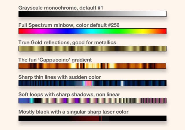
For the colorization of the shapes it has sets of color strips with 512 steps, called Gradients. Here are some examples:
The Mandelbrot and Julia fractals are really just points or boundaries - what Frax is colored by Frax will be the large areas between these limits.
One way to visualize that is a ring made from thin metal wire: a soap bubble forms a dome-shaped half-sphere over such a circle…
If the wire had a different outline, the thin film surface will smoothly change, to fit as tightly as possible.
That is in fact exactly what Frax will do as well: computing these ‘minimal surface’ fields, including their 3D height, which it will visualize with side-lighting, gloss, shadows and reflections…
The Gradient will then be ‘projected’ onto these surfaces (in one of two different methods covered under Contour) and when it gets to the 512th color, it will repeat the Gradient again.
At that point there are a number of new parameters possible on how that can be done… all of them with full help pages of their own here.
How quickly it uses the colors, and then repeats the whole strip, is governed by the Frequency.
Where it starts can be “rolled around” with Phase - which also is the parameter for the main swiping gesture, and the one Color item that is animated - simply be letting go, to scoot along on its own…
The colors in the Gradient can also be adjusted in Hue, Saturation, Lightness, Contrast, Blur etc. There are two West menus dedicated to Colors. Also: In Explore, the Shuffle icon on the Colors button exchanges these gradient strips.
Note: Gradients are each a fixed set of 512 steps, the controls happen afterward and do not alter the original versions, they shift and rotate them for custom variations by the user.
Note: When you save a fractal as a preset (the icon in the upper right corner), it will be stored in the device locally, as a very small data file (a few kbytes) and that includes the custom altered Gradient as well.
However, if you read the next pages, there are many ways to choose certain subsets, to alter the hues, change loops, invert values and generally adapt even just one single Gradient to stray far from its original form…
Note: Frax has a built-in collection of 256 Gradients Notice the great variety of hand-tuned styles:

Note: The Gradient East tab will bring up the South slider body with the actual gradient shown. Swiping horizontally across, one can choose among the 256 sets and pick a new gradient.
Note: Since there are only 640 pixels across on an iPhone, the 256 gradients are each represented by only a couple of pixels. The swiping gesture has therefore a 2:1 denser resolution here, to allow you to select precisely.
In other words, it will take two horizontal swipes to go through all gradients instead of one.
Also: your finger will not be directly over the current selection as you move. On purpose, not a bug :)
Frequency deals with how the gradient is applied to the fractal, specifically how often it is repeated along the whole shape.
If you think of a spiral, winding ten times around until it becomes just a single pixel, then you have the choice: from “all the way out” to “all the way in” you can use all the colors exactly once, or several times, or only half of them or just a few…
Here you see a creative application:
at 1.0 you can see all the colors once,
at the low 0.016 you get almost just
a single color, 0.16 a few more,
while at the 12x setting, the
gradient repeats over and
over, at ‘high frequency’
Tip: the “2 finger pinching” gesture controls Frequency and is actually more refined than the slider. You may get better results to pinch and then observe in realtime what the effects are.
Note: The most important aspect to understand is that Frequency is tightly coupled with “Phase”, the next tab below (read the next page for more).
Essentially Frequency chooses “how many” colors are used, and Phase then chooses “which ones”.
Low Frequency amounts to reducing the gradient to just a small portion, seeing usually just a few colors or a single one.
High Frequency will repeat the entire gradient, possibly several times.
In practice, this implies: you may like a certain set of colors in one gradient, but not all of them. You can set Frequency to only use half of the gradient, and then use phase to “roll around” what is in view!
The high frequency setting may sometimes appear overly wild at first - but it also has its creative uses!
Consider this example:

Here a simple black-to-white gradient (like #1) was repeated at very high frequency, leading to the zebra shaded tubes effect (which animates in Colors very nicely…) Factory Preset #173 is like that.
Most of the time it makes sense to use medium.
At roughly 0.2 to 1.0 there are always many colors available from the gradient, which allows you to accentuate the numerous detail levels in the fractal each with its own shade and hue.
Here an example, using Gradient 124

You can see the gradient from cyan to dark purplish shades, to orange into beige brown black.
Now the real use of Frequency: if you find a special area you like especially, such as the ink like deep blue, you can 2 finger spread to reduce Frequency and then swipe to “roll around” Phase until the entire fractal is now colored with only the desired hues…With practice, those two together are great!
For Low Frequency, there are many applications as well. Consider Preset #107, which has a soft matte quality, very lovely at large size.
Believe it or not - it uses almost the same gradient, the related #124 - but with a setting of only 0.043x

This means that out of all the 512 colors in the gradient, only a very small portion are seen at any one time, very smoothly interpolated to subtle shades in between.
If you load Preset #107 and then swipe in Colors… you will then see all the rest of the gradient slowly coming into view, just a few at a time. (try it!)
Bottom Line:
Frequency is enormously important and in conjunction with Phase they define entirely how a gradient is used to color the fractal.
The trick is to use the two gestures for these in combination, back and forth… : two finger pinch (or spread) for Frequency, together with one finger swipe for Phase.
Note: There is no “right or wrong” here.
It depends entirely on your intentions what you like and are trying to “bring out” in the fractal shape.
If you see certain effects in the factory presets in Frax, you can examine the Frequency setting - and soon know instinctively, how some were done.
Note: Totally high settings may lead to artifacts such as “raspy edges” or “Moiré interference”, depending on the gradient - some are very smooth, others have abrupt transitions.
Note: Also look at the Detail variable, under Global. Set very high it can accentuate banding and pixellation effects (although not to worry - these are only on the small screen previews, in high res rendering they will be smooth).
Phase is one of the key parameters determining the color of the fractal. It is linked to Frequency (the tab above, previous page, read more there) in taking the current gradient and defining the starting point where coloring will begin.
Phase is tied to the most basic single finger swipe gesture, and is the one animated variable in Colors.
In the example on the right, you can see the Phase slider moving from 0° to 360° over its whole range, which effectively “shifts” the rainbow spectrum gradient across the fractal.
If you focus for instance on the red area, you see how it “wanders along” the shapes.
Note: The effect will vary greatly depending on the gradient and the frequency.
You can see many creative applications of how varying Phase in realtime is used in the factory presets. Particularly strong examples are #42, #101 or #40, but dozens more are utilizing Phase.
In fact, every single fractal is entirely dependent on how the details and shapes get their color, which is predominantly governed by Frequency and Phase.
If you think of the gradient as 512 steps of color, then Frequency (below 1.0x) will determine the size of the subset region used and Phase will choose from where in the gradient that subset is taken.
Tip: to see that relationship in action, much like in the rainbow example above, use the two finger spread gesture repeatedly, until you see just a few colors over the entire screen. Then with the single finger swipe gesture you can observe all the colors “flying by” as they tint the fractal.
Note: Phase interacts with many other Spectrum and Colors variables such as Loop, Blur, Invert and such, but it is also influenced by less obvious parameters like 2D Marble in Textures.
Tip: If you are using the Phase gesture (swipe) and see no effect at all, (make sure that you are actually in Colors mode): Possibly the gradient contains a long stretch of a single color, such as this one, #41
![]()
in which case you may be moving around within the completely black region, to no avail ;)
Pinch a few times to increase Frequency, just to check - you can always Undo quickly.
Tip: The animation speed is dependent on how fast you swipe and then let go, the Phasing will continue on its own. Some are fun to do super fast, like a roller-coaster (swipe diagonally, also to change direction!), but consider also to use Phase slowly, for almost unnoticeable morphs over minutes…
Loop controls how the gradient is applied to the fractal, essentially forwards or backwards, but with a whole number of additional settings in between.
It is a bit subtle in its effects and initially easily overlooked, but you might come to see it as one of the special tools to get things perfectly tuned.
Here are the there basic values: the slider at far left is at minimum (0), at the far right is maximum (1) and the center position (0.5)
You can see the gradient is either
dark to light, light to dark,
or dark-light-dark in the middle.
Loop is called loop because the gradient will always be used repeatedly, in a loop, (how often being governed by the Frequency parameter) and there are several options how that can be done:
If you think of the gradient as a sequence of 512 colors, then you can
scan from 1 to 512,
like A to Z,
or scan it in reverse,
512 back down to 1,
like Z to A.
Those are the Min Max settings above.
The middle slider position, 0.5, will Loop differently:
it goes from 1 to 512
then back down to 1,
like A to Z to A,
and then they all repeat that looping indefinitely…
So you get not only all gradients as you see them, but optionally they can be accessed in reverse and looping smoothly back and forth.
Here are some practical considerations and applications for Loop settings.
A sharp line such as in Gradient #69 will show up as seen here either dark to light, or the YinYang reverse at 1.0 light to dark.
Interestingly then at 0.5, the smooth loop will eliminate the sharp transition!
Tip: if you have edge artifacts you can use 0.5 to create a smoother final image.
Even more unusual are the other values between the three fixed ones: they begin a smooth back and forth looping not at the A to Z, but somewhere in the middle, as if you loop A to Q and back again…
Shown here two values of smooth loops.
Tip: what is not immediately obvious, but if in the analogy you loop A to Q and back… that also implies you will never see R S T… etc…
So in effect you can use the in-between settings of Loop to eliminate certain color ranges within a gradient!
In these two example images you see that the gradient contains an orange range within the turquoise.
Using Loop one can shift the point of the smooth reversal interactively and see how it “swallows up” certain colors and stays smooth.
Note that Phase and Frequency both have great influence on the results of course (read more there).
Tip: the best way to exploit all the subtle possibilities is to use all three at once. Since Loop does not have a direct gesture or edge slider, but Phase and Frequency do, it is easiest this way:
Adjust Loop (tab selected) with the South Slider, while you can always do the Swipe for Phase and Pinch for Frequency at the same time.
For any one location there are probably dozens, if not hundreds, of meaningful variations how to color which feature, at what level of zoom…
The interplay of the location controls, the lighting and then the texturing are all in addition to the color processes - covered elsewhere here. Much to learn!
Tip: remember that all presets can be selectively loaded in parts - so if you find an inspiring file in the cloud as well, you can extract “only the location”.
Just tap-and-hold the preset thumbnail for 3 secs…
Bottom Line: this kind of subtle coloring would not be possible without the unsung hero, Loop…

There are several functions that extend the use of the color gradient by toggling color values.
Invert, Hue and Light are all three binary switches, as the little icon on the tab indicates.
The effect is immediately reflected in the South slider gradient display, so you can gauge directly if the result is as you expected, or could be potentially interesting.
These three can be very useful quick tools in the process of playing with colorization of your fractal. Beginners may make the mistake of “just checking it out” a couple times, seeing a quick color flash, and if it is not immediately perfect, dismiss it as “not doing very much” ;)
However, once you understand better how they operate you will appreciate them as sweet little additions to your arsenal.
Tip: it is important to realize that all three toggles work with each other, resulting in eight different combinations, with only three tabs. In other words: do not merely toggle each tab back and forth, but try all of the variations…
Here preset #51 was used to show what happens:

In the case of Invert, the colors in the gradient are altered to become the complementary hue on the standard color wheel.
The effect is shown here with the normal wheel on the left and the inverted version on the right:

Red flips to its opposite, Cyan
Green becomes Magenta
Blue turns into Yellow
Important: Black is replaced with White as well.
In the image above, the Invert example shows the yellows now blue, and the black stripes now white, with dark original tones suddenly very visible as light areas in between the stalks.
With the tab Hue, the effect is different: the color wheel is changing direction instead:

Red becomes Green
Green becomes Red
Blue stays Blue
White and Black stay as they are as well
This is quite a different result and in the above example you can see there are now light green stalks with black bands, quite a different look.
Tip: at this point a reminder: all three of these tabs are real toggles - so a second tap will simply revert back to the previous state (losslessly, as it were)
Previous, not Normal state, if you combine them…
The bottom tab Light stands for the Lightness of the color, inverting how light or dark it is, but while preserving the hue! Again, very different results:

Dark Red becomes light Red
But medium solid Red stays the same.
Dark Green and dark Blue turn into the light counterparts respectively, medium unaffected.
And white turns to black - medium grey constant.
And as the bottom four examples show, the fun is in the combinations of these toggles, all eight being different from each other, every time. Not all are instant perfect art, but they may inspire and they certainly can surprise.
Note: an important detail needs to be pointed out here still: one may have an initial reaction of “never mind, I can do that later in Photoshop”, where you can also find an Invert function or rotate the hue…
But: in Frax these operations are done at the gradient level, not just inverting the final image.
That means, if you look closer at the eight examples above - the entire lighting engine with the glossy reflections is done after the gradient coloring and you preserve all the specular highlights!
Tip: if you tap one of the toggles and see no effect at all, it isn't a bug but it has to do with the nature of the operation: The white and black inversion at the gradient level using “Light” will show no change if the gradient doesn’t contain any white or black (such as the plain spectrum #256)
Or the Hue inversion which does not affect blue, may not have visible results if your gradient is mostly blue…
Give it a shot - lovely things can be found, and it is different for each gradient, every time…

The first tab under Colors allows you to change the Hue of the fractal.
The colors in the current gradient are moved along the color wheel along the clockwise direction, as shown here.
So if you initially have Green on your screen, it will slowly become yellow and orange, then red and so forth through the entire spectrum rainbow.
Note: Black and White remain unaltered.
Note: The process follows a circular motion and therefore the South Slider is using 360° steps in degrees. Thus the normal unaltered state on the far left at 0° is identical to 360°, wrapping around.
Note: Hue Rotate is also available as one of the basic gestures in Color Mode - the two finger rotate.
Tip: Since the gesture for Frequency, which is the two finger pinch or spread, can be quite similar to a two finger rotate, the easiest method to make sure you get Hue is for one finger to remain fixed, while the other moves…
Alternatively one can use one finger from each hand, a matter of preference.
Note: if you have a monochrome gradient, there will be no apparent change, as Black, White and shades of Grey are considered having a saturation of zero, i.e. no color.
However: if you turn a color gradient monochrome by reducing Saturation, and then rotate Hue, you will find upon adding Saturation again… that it has changed.
Tip: Creatively the Hue Rotate function is a very quick way to fine tune your fractal.
As an example: say you have a wavy area that is green, but maybe you think it could look nicely ‘watery’, if only it were blue…- you could certainly find a new gradient containing blue… but it may be a lot faster to use the quick gesture to rotate the hue until the green becomes blue…
Note: the Hue is also affected greatly by the use of colored light sources under the Tint menu (4th L2 tab in Lights). If a light is strongly saturated to red there, it will overpower all the hue settings in the Colors menu…
However, shuffling Colors or Lights should not lead to this situation as they are purposely not using tinted lights…
The second tab under Colors allows you to change the Saturation of the fractal.
The fully saturated color wheel looks like this, well known from standard color pickers ➔
Reducing the value to zero, all colors become merely shades of grey, and the color wheel begins to look like this. ➔
It is the minimum setting for the Saturation slider at the far left.
Reducing not quite all the way brings out nice pastel soft colors as in this example ➔
But there are a few things worth knowing about the way Frax uses the Saturation parameter…
For one thing, it is not a simple percentage control, the South Slider uses a dual range, plus and minus 100%, with the normal setting in the Center at zero:
At that middle position, the colors are still fully saturated, and there are 100 percentage steps towards no saturation = grey.
Moving to the right you will amplify all colors to attain full saturation, which is of course extremely dependent on the current gradient.
Note: If you have a gradient like the solid rainbow #256 you actually would not see any change going from the 0% center to the +100% maximum, since the colors are all already fully saturated.
Other gradients will exhibit drastic changes.
Here the creative possibilities begin, but they are no longer based on single parameters, but their complex interconnected relationships.
Saturation for instance seems quite simplistic when discussed isolated, as above. But the real fun lies in the links to other variables, such as Lightness, Blur, Highlight, Shadow, Contrast, Hue and more…
Note: Saturation doesn’t have a dedicated gesture like Hue, but it has the next best thing - a hidden Edge Slider. (If you have not quite gotten the hang of those, do look at the specific help page, they are extremely versatile and much fun!)
The third tab under Colors allows you to change the Lightness of the fractal.
It is a dual percentage South Slider, like Saturation, and produces very interesting and useful effects to alter the appearance of the fractal.
The key thing to understand about Lightness is that it makes the gradient colors darker or lighter, so much so that they become black and white at the extremes! Notice that at +75% there are similar pastel colors as in reducing Saturation, at -75% the darker tones that can become nicely metallic.

Note: It can be a bit confusing at first that there are several parameters sounding somewhat similar, such as Brightness, Highlight, Lights & Lightness.
There is method to the madness though and good reason to have each one, in fact some are repeated in several tab sets, again with sensible rationale.
In a nutshell, Lightness operates on the gradient, before it is applied to the fractal, which means that the lighting parameters are added later, and they have their own control over such things as the glossiness.
Note: Lightness does not have a dedicated gesture but when you are in Colors, the right Edge Slider is available for realtime control.
Note: Much like Saturation, this variable is quite correlated with other controls and in such creative uses as “metallic colors” we explain their interplay.
Here is an example of Lightness achieving unusual effects: the fractal unaltered is seen at 0 %, with the gradient using rather ‘loud’ flat colors (such a state can easily be reached with high Contrast).
Much more interesting: soft ‘rubber pastels’ 80%, or the dark glowing ‘lava, flame’ colors at -40%.
Try pulling back just 3% from solid Black or White!

Another parameter to alter the gradient is Contrast.
While it sounds like similar controls in photo editing software, the functionality is quite different and worth understanding.
First point: not the final image of the fractal as such is treated afterwards, but the color gradient is changed before it is applied to the texture and also before the lights are added.
The second point is better illustrated by comparing it to how Photoshop would look: on the left the original, on the right standard PS Contrast at 100%:

The Gradient # 95 was used, with mostly earthy tones, where normal PS contrast turns that into stronger yellows, darker browns towards black.
In Frax however the Contrast function is actually enhancing the differences between neighboring colors inside the gradient, effectively sharpening.
This actually leads at higher settings to creating new colors, such as seen below: grey turning dark blue, tan turning red and yellow turning white… :

Both differences together can be seen in the third image above: the contrast acting upon the gradient first leads to dramatic changes in the colors themselves (including the new ones added), and then the fact that it was done in the gradient and not in the image lets you add the glossy highlights afterwards, getting very realistic lacquered, plastic, nailpolish or Ferrari red looks…
Note: Contrast does not have a dedicated gesture, but like Saturation and Lightness it is using a realtime Edge Slider in Colors mode, horizontally at the top.
Blur is the twin brother of Contrast in Frax. It is worth reading the previous page about the special qualities of Contrast, as they apply in a related fashion to Blur as well.
Here a concrete example of this extremely useful function, using strong colors as our starting point, on the left at 0%. With just a little bit of Blur added, the colors begin to smoothly run together, creating new soft shades, all the way to a blended brown…

The key is to understand that the fractal shape will stay detailed and sharp as ever - the final gloss will be added crisp and clear afterwards - all blurring occurs only within the colors, on top of the surface!
To make sure this point is really entirely clear, as it were, here is a direct comparison of the normal Blur working on the image, averaging pixels - as in PS - versus Frax smoothly blurring the gradient instead:

Note: Blur does not have a dedicated gesture, but is using one of the realtime Edge Sliders, in Colors at the top edge of the screen.
Note: Blur is sharing that Edge Slider with Contrast, basically center normal, to the left smooth Blurring, to the right sharpening Contrast.
However using the individual tabs one can use both together meaningfully, as the above example actually shows: Contrast had created new colors like the Blue on the left side and then Blur acts on the resulting new gradient, including that Blue!
So they are not merely a single control but their ranges can overlap - and in fact the most interesting subtle effects happen precisely in that combined use. All other color controls are influencing each other, but also Lights and 2D Marbling in Textures as well.
Tip: Try preset #34 which has some Blur…
Highlight is actually a parameter from the lighting engine and described under Lights All in detail.
Note: It is found under the Colors menu as well, since it affects the overall appearance of the fractal a great deal and is very handy to have directly adjacent to all other color tabs.
Shadow is actually a parameter from the lighting engine and described under Lights All in detail.
Note: It is found under the Colors menu as well, since it affects the overall appearance of the fractal a great deal and is very handy to have directly adjacent to all other color tabs.
Frax is unusual in the way it renders Mandelbrot and Julia fractals by adding height as a variable dimension to what had normally been flat 2D slices.
Think of raising up areas ‘like little mountains’. The height is determined by the distance to the fractal.
This brings a number of parameters into play which alter the way this height is perceived: specifically the use of two light sources that are pointed at the fractal. They create the perception of a proper physical model with shading, glossy highlights, reflections…
For each Light there is the 3D position, comprised of the ‘360° angle all around’, and the so called inclination, which is ‘the height above’ the scene, like the ‘sun at noon’ versus ‘at sunset’.
The gloss can be controlled in its strength, size, sheen, reflection shape and rotation - for both lights at once or adjustable individually in Frax Pro.
The lighting engine is one of the central innovations in Frax - to allow a 3D height field in realtime.
The entire realm of 2D Mandelbrots and Julias are in there as well - but look what fun 3D lights are:

In the Explore mode Lights there are several gestures as well as ‘Edge Sliders’ dedicated to lighting parameters, all of which can be controlled in realtime.
One of them can also be animated: the 3D position is steered by simple swiping, and upon letting go, will continue on its own…
Note: the gesture at the time of release defines how fast the lights will scoot along and remain at that speed indefinitely. The South Edge Slider will allow you to control that speed afterwards as well.
Note: there is a 360° position that can be set individually for Light 1 and 2 in Design, but in Explore, the gesture moves both Lights in unison!
Important: the gesture is a complex control of both the x and y position and the angle at which it will move, allowing many different kinds of paths and effects. Do read the page for 360° Angle…!
Lights in the Design menu tree is a West tab which has a second level of West tabs: “All”, “1” or “2” as well as Tint.
Each of these will bring up its own set of East tabs!
Choosing Lights 1 or 2 will let you use 7 parameters for each light independently, while Lights All will move some of them in unison together and offer other general lighting features.
Selecting the "Tint" tab will let you control four light parameters - 1 and 2, Ambient and the Backdrop - each with three subtabs for Brightness, Hue and Saturation.
Tip: the bottom West tab with the Shuffle icon will randomize either both lights or only the settings for light 1 or 2 respectively… You can watch the tiny triangles move around on the East tabs during shuffle operations :)
Shuffle in the Explore Lights mode affects both.
It is important to understand that sometimes certain sliders may seem to have no effect. It is for instance possible to turn down the Gloss to zero, so a Light is simply not visible.
Similarly the Balance between 1 and 2 can be set all the way to one side, or the Size parameter set very small or there could be zero Height - all of which make many changes…invisible.
Tip: a very good way to get a feel for the range of possible effects is to use the Shuffle icon on the Explore Lights button: you will cycle through dozens of combined changes to ALL parameters all at once. You can always Shuffle until you get close and then switch to fine-tune it in Design.
Tip: The most realistic effects use both lights in subtle complementary ways, such as one glossy and one soft sheen. Use the Balance slider under Lights All all the way left to work only on Light 1, get it ‘just so’, then Balance right to isolate Light 2!
Classic Mandelbrot and Julia fractals are essentially flat, but in Frax there is the option to change to a 3D height field, seen from directly above.
The control for this is 3D Height under Lights All. Here you can choose to work in 2D - as the grey image shows here, or in 3D - as in the color area.

Tip: Obviously 3D is a lot of fun, but 2D can have its own charm sometimes, do not dismiss it entirely… Simply turn Height down to zero…
Without any height the fractal can still be colored and texturized, but there will be no gloss (‘specular highlights’) or reflections or shadows, and thus no depth perception.
How much height is used can have significant impact on the overall appearance, since it changes the size of the glossy area and also the way the textures have a depthy relief.
Note: Textures have their own separate parameter called 3D Wrinkle under Textures All. It defines the height of the surface features in addition to the 3D height discussed here.
Also, 3D Height has its own dedicated Gesture: when you are in Lights mode in Explore it is the two-finger pinch or spread. This is the fastest way to get a feeling for the variations of depth.
Tip: Often it is not 100% full height that yields the most realistic effect. Try slight settings like 5-10%!
Using preset #92 you can see the drastic impact of going from 2D flat to 3D height: load it, accept via check mark, switch to Lights and then try the two finger pinch gesture… to see this live:

Interestingly, the full 100% setting may be too much depth, somewhere between the 20 and 50% examples is probably best, although it depends on what you are hoping to achieve.
But 3D Height has much more influence on the lights still. The curvature of the surfaces increasing will also change the way the gloss and reflections are seen: With more height the specular highlight will become smaller and sharper.
Also the shadows will turn darker, shading the overall appearance towards deeper tones.
Tip: some of the coolest light settings are directly from one side with strong relief. This creates nearly black shadows. To lighten just those dark areas use the “Shadow” control…
In the following example image the changes in the gloss are entirely due to the 3D height settings, separate from Size, Shine and other parameters!
Preset #32 is a nice example for all these variations. Note the darker overall tone and deeper shadows, the smaller gloss, and also the changes in the window-like reflections…!

The second tab for Lights All is a simple slider to adjust the relative strength of the two light sources in Frax.
While fine-tuning the overall appearance, you could adjust the Gloss in Light 1 and 2 sequentially - but much nicer to use Balance to play with them both together. Here the sheen of 1 and the gloss of 2:

Sometimes there is a certain setting that makes the look perfect - in this example probably around 80% Just having Light 1 or just light 2 would not be nearly as interesting as the right mix of both.
It is very easy and interactive to use a single control to over- and undershoot all possible combinations and iteratively find the one you like.
Note: Balance is also available as the Edge Slider in Lights, horizontally at the top edge of the screen. Having the combination of Gloss, Shadow and Balance as Edge Sliders, plus the combination of 360° position plus inclination all within the swipe gesture (and pinch for 3D height, 2D rotate for Light shape twisting…) is almost the complete suite of parameters all for realtime instant access, switching even faster than via tabs in Design. (Although it is great to have the exact values to control precisely and repeatably in Design).
Tip: For specific work, Balance can be used to focus on each Light separately. Move it left to isolate Light 1, tweak it to perfection, then move Balance right to do the same with Light 2. Afterwards move Balance to some spot in the middle where the two blend nicely, as above…
Note: Technically speaking, Balance is not altering the Gloss or Brightness or Highlight values, but attenuating the two Lights with its own parameter.
Tip: while it is easy to see very glossy spots being moved and balanced, you can also achieve very interesting results with simple sheen, coming from both sides - using Balance to get it right:

Note: The Balance parameter can also be a source of confusion: if set only to one side, one of the lights will be essentially switched-off, and moving the values will seemingly have no effect at all…
If you feel as if some sliders show no effect, check the Balance slider in Lights All first.
Later the same will apply to Textures All, which also features a Balance between two components.
The third tab under Lights All is a global parameter to adjust the overall strength of the entire lighting engine, called Brightness.
It may seem as if there are several variables that are all affecting the lights - and their brightness… and that is in fact true. But for good reason :)
Brightness is actually more of a creative control, than a mere utility, and it has very peculiar characteristics if you start to play with it…
The key is to understand that the lighting in general will also change the way all colors are perceived - some of these points are mentioned in the various pages under Colors - and thus many settings will influence and override others.
Especially Lightness under Colors is related - but by far not identical. It affects the gradient colors, whereas Brightness affects the lighting added to those colors later.
Here is a concrete example: preset #43 is shown in the center - 100% being the middle position and ‘normal’ for Brightness. As it goes down to 0%, the colors darken - up to the maximum of 200% they get very flat, blown out - (but not Lightness white!)
The upper right setting at 33% combined with Saturation and Contrast - brings out metallics…:

Tip: Brightness is great at achieving metallic effects - use solid full saturated colors, glossy, then move Brightness almost to zero - but not quite… At 2-5% strength you can get subtle metallic sheen!
Note: Brightness is also available as a gesture in the Lights mode: it is the Two Finger Swipe. Just tap and move up and down and you should see the full range of Brightness…
This gesture is easily overlooked or forgotten - a bit of a shame since Brightness is such a useful control to bring up the overall final impact of your image - many times using relief lighting can turn things interesting - but dark… This can fix it!
Brightness is one interesting key player in this connected system - it mostly does what the name implies and moves the overall effect of the lighting up or down - but: the 100% mark is at the center of its range - and then there is a kind of overdrive available up to 200%! In situations where the other factors are all leading to a darkish image, this can then be used to raise it again, beyond the normal maximum for purely creative effects…sort of a spinal tappian “11” on an amplifier.
Note: if one reduces the Gloss in each Light - the same as Highlight for both Lights at once - then with zero gloss one would assume it is identical to ‘just 2D flat’ - but that too is not the case: moving 3D Height will prove there is a basic tone change even without any gloss.
Tip: Highlight can be thought of creatively in the following manner…
You might be using Lightness under Colors for its interesting powers to alter the entire fractal image towards white to get pastelly light colors, or towards black to get dark metallic ones.
The optimal setting for that sweet zone of pastels and metallics is quite narrow (read more under Lightness). However - now you have lost the other power of the Lightness control - to vary the overall luminance…
And that is where Brightness comes in very nicely - to make the whole scene appear punchier and better equalized, brighter for pure brightness sake.
Of course you can still lose the pastelly or metallic character if you go too far - it is still a connected system…
The third tab under Lights All is controlling the Size of the glossy ‘spot’, often called the specular highlight.
This is available for each Light separately, but here it is forcing both lights at the same time in unison.
Note: Size is a linear percentage from 0 to 100%, but it may help to think of these limits pertaining to a cone-shaped spotlight, changing its opening angle from about 1° to 20° (shown here exaggerated)
Tip: say Light 1 is set to 20% and Light 2 to 80%, then the moment you move the Lights All control Size to 50%, both of them will jump to that value.
You might be better off to use the Size control for each individual light, 1 or 2, if you are after a specific effect.
Note: Size does not have a Gesture nor an Edge slider associated with it. Only controls in Design.
Tip: Size is quite closely linked with Shine, the next tab, and should be used together. Here for example are combinations of the Size and Shine sliders at their minimum and maximum settings… :

The fourth tab under Lights All is controlling the shininess of the glossy area. At its maximum setting of 100% it is “as sharp as it can be”, with hard edges and the reflections clearly visible, as in polished or glossy materials:

At minimum, towards zero it becomes more matte and soft edged, like sheen or luster, silk or velvet:

An example was already shown on the Size page: with very large Size, but Shine at the low range, can achieve nice soft lighting.
Tip: it is particularly interesting to have one light set to such a soft edged sheen, while the second light has a small distinctly shiny gloss setting, on opposite sides.
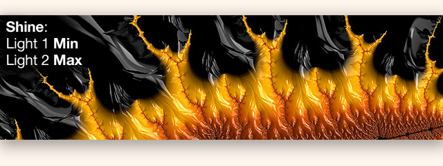
It approximates very realistic scenarios of multiple illumination sources from many angles. The first glossy light from the left would leave the right side in dark shadows, but the second light acts as a low-gloss “diffuser” to fill in the dark areas.
Worth experimenting with the combination of both.
Highlight under Lights All is controlling the Gloss for both Lights together at once.
At the maximum 100% the gloss is white - regardless of the color underneath - broken up by the texture ridges.
At 50% the highlights lose strength, the color shines through - such as the orange in the inner spiral - so the gloss is merely a brighter orange at 25%, on black it is just a slightly lighter grey.
Finally at 0% Highlight there is no gloss at all, the image becomes 2D flat and the texture is entirely invisible now as well.
Note: the Tint menu can create individual colored lights and ambience, which will greatly affect the appearance of the Highlights as well.
Note: it may as well have been called Gloss, but the word evokes a specific image of highly polished or lacquered materials - which may not be exactly what is shown at the time, hence the change to “Highlight” as a more generic term.
Highlight is also available as an Edge Slider (on the right screen edge, vertical) where both Gloss values are moved together.
Note: the two individual Gloss sliders are moving in averaged unison, trying to preserve the proportions.
Note: it works in the other direction as well: moving Highlight to 100%, both individual Gloss sliders will be at 100% as well. If you then move the Gloss for Light 1 down to 0% and go back to Lights All, you find the Highlight slider has moved to 50%!
Tip: often the gloss is harsh white. This can be fun at times, such as sharp white specks on plastic looking styles.
But many other materials absorb, disperse or diffuse the lights a bit - pulling Highlight back so both Lights are just below white, they will be transparent and take on the color below… nice!

Left: nice real lacquer, right: blown-out, blooming
Shadow under Lights All is a useful tool with a simple premise: many scenes tend to get dark, especially since wherever lights are shining, there is the other side - in deep shadows. Reducing the lights themselves to minimize that darkness would be wrong - the gloss is extremely effective, creatively desirable and needed.
So a dedicated control was added that simply lightens only the dark areas. Period.
Shadow is a plain linear percentage, at the minimal left setting of 0% no correction is applied and all shadows are solid black.
The maximum setting of 100% the shading is gone and only the plain colors of the gradient are left, as if in 2D without any height.
Note: the gradient itself can contain dark shades of course, but that is separate from shadows via lights
Note: Shadow is really an "ambient light source" shining in all directions, unlike Lights 1 and 2.
It actually can also be colorized - which interferes with and often overpowers the coloring of the gradient, but with judicious use can also be very effective. Use the fourth West Level 2 Tab under Lights, "Tint" and you find Shadow there has its own trio of Brightness, Saturation and Hue.
Shadow is a one trick pony, a special screwdriver in the toolkit. It may not be used all the time, but once in a while it is indispensable to fix certain scenes or to bring out the right mixture of glossy lighting with a diffused ambient light.
Consider this all-too-dark scene: 3D relief lights forces deep shady regions. Adding 80% Shadow fix creates this neat cartoon-sketchy render style!

Note: Shadow is also available as an Edge Slider in Lights mode, the left screen edge vertical, complementary to Highlights on the right screen edge.
Tip: it is worth playing with the differences between all the parameters that control the overall luminance of the final image - Shadow being purposely limited to deal only with dark tones, raising them up while leaving all above that unaffected.
Whereas Brightness moves the entire range upwards - the lighter parts into potential blow out blooming levels.
And Lightness alters the luminance of the gradient - forcing colors towards solid white.
Each has its use and cannot take the place of the others - together they are quite an arsenal of tools - once you understand when to pick which one… Just try… overshoot, undershoot, iterate to perfect!
The appearance of a material described as “glossy” can be reduced to one specific aspect: the presence of bright shiny spots, when a polished or lacquered surface reflects a light source.
Gloss is the parameter in Frax that controls how bright those so called ‘specular highlights’ are. It can be highly effective to create a 3D depthy look:

Note: Gloss has already been mentioned a few times in the general pages about Lights and the specific functions under Lights All. (It may be good to start a few pagers earlier, if you just jumped in here…)
Gloss is really only one component in the overall appearance of the lighting - it merely attenuates the strength of each light, not unlike a dimmer control on a physical lamp. However, there are many more factors playing into it: the position, inclination, the size, the sheen, the reflection shape and its rotation, and even many of the color controls affect how we perceive the final result.
Note: Even seemingly unrelated functions such as 3D Height have seriously great impact on the size and feel and the softness of the edges and the overall appearance of Gloss. Do try to vary height early-on in the exploration process, you may find a setting that will influence how all parameters are set afterwards…
Here are several examples of creative applications using the Gloss control.
In preset #62, here a detail deeply zoomed in, one can see an important aspect: Gloss defines the textures - the scaly ‘black dragon’ here is catching the gloss from two lights, controlled by the texture height (very slight) and the balance of a smooth and a striped component with much 3D height:

A completely different style here: the “milky liquid”, as in preset #187, consists of highly blurred colors in a light gradient, with 2D Marbling at minimum. Also: very low 3D Height and Shadows is used to raise the ambient illumination with only a soft hint of shadows remaining.
But the entire effect hinges on very bright Gloss forcing sharp white highlights on the surfaces:

Tip: do try the Shuffle icon at the bottom of the Lights button - it will show you a new set of lighting with each tap - changing all 20+ variables at once.
Note: Gloss is an Edge Slider under Lights, the right vertical screen edge. However, that is forcing both lights in unison and thus named “Highlights”. The first tab under each Light 1 & 2 is called Gloss and controls one light separate from the other.
Tip: this allows the kind of multiple light interplay that we know from natural surroundings, where both hard and soft shadows, strong highlights and weak sheen, tiny specular dots and wide area glows are all co-existent.
You can set one light to have very bright gloss with sharp edges and a reflected window-cross shape, and the second light to a diffused, dull, soft-edged blob ;) and position each one to complement the other, or one to create the full spotlight and the other to lighten the shadow from solid blacks.
Here is an extreme dual light example: it could really be the record setting variation: this image consists pretty much of nothing but the Gloss!
There is hardly any fractal visible, no stalks, no textures on shapes, all we see is ghostly nebulas, or are they plasma blobs or electron microscopy? They are simply dual Glosses at extreme settings, around the faint green center fractal line.
Exactly the kind of unexpected result that may you may be the first ever to find, in the vast Frax space.

Tip: if you are really interested in understanding the details and getting to the advanced stages of Frax, it would be good to read the entire set of help pages and get a handle on all the correlations and influences of each parameter on the others.
The above examples of Gloss would all vanish instantly if any of several other variables were slightly changed… and so it is nearly impossible to recreate them without a solid grasp and some experience. :)
While Incidence is not exactly an every-day word (Coincidence is, coincidentally…) it is correct.
Each light can be freely positioned around the fractal 3D ‘height field’.
If you imagine the scene being ‘covered by a half sphere of glass’, then any point can be reached on that surface in order to position a spotlight, shining directly towards the center point of the fractal.
What you need is the angle in 360° all around, and a second number determines how high up the spot will be - this is the Incidence Angle, which is expressed in 0 - 90° degrees.
Note: it is enough to use only 90° vertically since one only needs to specify the height above ground (below 0 it would illuminate from below and thus remain invisible) and above 90° the height simply reverses (and the light would move downwards)
Important: it matters a great deal how this inclination is set! If a light is directly overhead, it would be like sunshine at midday, coming straight down… the result being three things:
a) a very strong light - in fact the strongest possible illumination, cranking all the colors up to their maximum value…
b) hardly any shadows, since they would all be directly below the ‘terrain’, hidden…
c) a seemingly uselessly dead position control - because at the very top of that half sphere there is no defined ‘angle’ any more. (think of a globe: the equator being the largest circle at 0 degrees, but then as you move 90° towards the north pole, the circles become smaller and finally end up at zero radius when you reach the very top spot…)
Tip: creatively speaking, the more interesting effects happen with Incidence on the right side of the slider, possibly all the way to 0° minimum.
At that setting, the 360° position will travel the largest circle all around, and illuminate the fractal terrain with the harshest side lighting, leading to the most intense 3D relief effect, as shown here:

As you can see, this also leads to the darkest shadows and accentuating the texture details.
Moving Incidence to the left, the light travelling upwards, will lessen those effects, as seen in the middle image above.
Note: if Incidence is the position on that half sphere over the scene, then 3D Height can be thought of as “how curved is that shape” - it can be only a shallow deflated section far from being anywhere near a “half sphere”.
Here is the same scene as in the middle above:
Incidence still max 90° but the 3D Height is quite low, diffusing the gloss over a large area and lightening all shadows as well.
Nice metallic sheen, incidentally…
Note: the most basic realtime gesture for Lights is the swipe - it controls the position of the lights. However, knowing the details about the 360° Angle and Incidence, you then realize that the swiping is controlling all of these parameters together - and for both lights at the same time!
In other words: you are essentially touching that glassy half-sphere and travelling around the entire surface area, changing the position and inclination, of both Lights.
Note: If you think about this further, it not only matters where you begin to touch the half sphere, but also in which direction you then move: the lights will not “jump to that position” you touched - they will stay as they are - but: they will then follow your motion as you swipe further, both travelling a 3D curve around the surface of the glass sphere!
So what looks like a simple straight line swipe, is really an ellipsoid space curve - and what’s more: as you let go it will continue on its own, animated!
Note: Two more implications there:
a) it will keep the last speed - so how fast you swipe and when you let go is very important - you are basically scooting the lights along as you release. btw: the speed is purely your gesture, which is quite powerful, free and fun - but does require a bit of experience and dexterity ;) Once moving you can also use the South Edge Slider to change the speed!
b) the gloss position will swing from side to side in an elliptical path.
What this all means: there is not one swipe, but there are dozens of possible paths that a simple swipe can produce!
Really quite unexpected, possibly unprecedented (we have not seen any comparable gesture anywhere), and probably also a little unsettling.
But once you do realize how it all works, there are many very cool effects to achieve! But they take a bit of practice, of course…
An example: you touch the center of the screen and then swipe straight upwards…: this is like going in a straight large circle from the equator to the north pole. You will have the light changing from total side lighting (3D relief, harsh shadows, etc) to the true overhead position (straight down, strongest light, way bright, no shadows) and then back down again on the other side…
Another possibility: you touch at the very bottom of the screen and swipe straight horizontal to the edge (which even seems silly at first…! How could a light possibly make any sense moving around down there ??)
But it may be the coolest one yet… - here is what happens:
You are at the equator level - the light shining from the edge to the middle, creating the strong relief effect in the terrain…
The push to the side is a position that is actually not possible for the light, it will travel fixed to the equator around the globe, (and not shoot off into space, as the swipe direction would indicate…)
So really you are shooting the light in a path around the whole equator at zero degrees height, illuminating from all sides, with maximum 3D relief!
This is very cool for the simple reason that you maintain the same Incidence - the relief effect, the dark shadows etc, etc- and keep the look you have, while the light keeps moving, animated.
In the previous example, you move from the side to the top, changing the look tremendously - probably ruining it as you go ;) - becoming way too bright above, for instance.
Between these two examples, there are many dozens of smooth space curves around the globe at some angle, wrapping around the other half again.
Each of those 3D paths will have a slightly different effect on the light effect and it can take quite a bit of trial and error to really get good at this game…
Then again: there IS no right or wrong, you are NOT chasing after a high score… you can just mess around with the gesture and see what you get, with many truly inspiring results! Just go for it: try different starting spots, and move in some direction
All of this sounds more complex than it actually is, a bit like ‘describing the 23 muscles and actions to execute a basic sneeze’… no point in over thinking here - just try it.
However, it was worth explaining it to point out that quite unexpected motion may get you the most interesting results. Just poking around haplessly would not ever get a full horizontal 360° lighting motion, travelling all around the fractal with both lights, from all sides… :)
Tip: as a very cute thing to try: swipe and let go, then tap the right edge of the screen to wake up the tabs to come back… and you can see the tiny triangles (‘mini data-slider knobs’) for Incidence and Position dance along, showing how they change with the motion.
With the right curves, you will see them move in very counter-intuitive ways, with sudden pauses, changing speed - and switch from 1 to 2, see both!
The third tab for each light is the 3D position around the fractal ‘heightfield’, expressed as an angle from 0 to 360° degrees.
This is a single number, on a single slider, and thus not enough to specify the 3D part of the position - what is needed is the second parameter, defining the height in addition to the angle, which is called Incidence.
Note: if you just jumped in here directly, it is quite worthwhile to read the pages preceding this, which explained a lot of detail around Incidence, and at the same time to its cousin, 360° Angle.
Tip: the most interesting information discussed in the pages for Incidence is how the swiping gesture in the Lights mode affects all four numbers at once - the height and the position, for both 1 and 2 - and then as you let go, animates it as a 3D space curve - quite a bit more than a straight line swipe would appear to be capable of doing!
Tip: for starters, use the gesture in Lights All by moving in a large circle around the screen… you will see the lights follow you, shining from all directions towards the center…
Use preset #32 for instance, it has two distinct lights with gloss and no distracting texture.
Here are just a few examples of the lights at various angles, all else remaining the same…

Important: the position of the lights is actually a central element in a key characteristic style of Frax: the shapes of the fractal, such as the “stalks” or spirals etc, can appear either convex or concave!
In this example, the left side is clearly ‘popping out’ towards you, while the right is equally obviously layered ‘inwards’. Identical in every respect it is merely the light angles that create a perfect illusion, by placing depth cues via shadows and gloss!!

If you look closer at the body of the spiral, such as the blue area, you see that the shadowing is at the bottom, whereas on the right the darker portion is in the top edge… Also the right blue is casting a drop shadow onto the orange, and the orange in turn onto the green - which the brain interprets as “it has to be below”.
There is an entire area of computer graphics dealing with “shape from shading”, which our gray matter handles very elegantly and fast. The beauty of that in our case is that we can be so easily fooled into a perception of depth and geometry - even with just tiny suggestions. And that it why the light angle (and inclination) are so very powerful…
Tip: If you use the swipe gesture in Lights, move in a large circle slowly and as the lights follow around the edge, you can sometimes even see your entire depth perception flip up or down, valleys becoming mountains.. and back again. Good to know how to use this effectively!
Tip: this is also a good time to try the pinching / spreading gesture to alter the 3D height, which interacts with the glossiness, and in that way influences how to move the 3D angle to achieve pleasing results…
Note: the ambiguous nature of Frax will come up again in the Textures - one can also accentuate certain features via the two components there. In conjunction with the lighting, the depth cueing can be extremely effective.
You can achieve stalks being ‘solid tentacles’ and with just a few changes they become ‘valleys cut into a high plateau’…
Good to know how to create such effects at will, the above example showing how merely the angle alone can already achieve a great deal.
Each source for illumination in Frax is like a spotlight that is also variable in its Size - think of it as a cone, which can be opened or closed to allow more or less light to shine. The South slider is moving from Min to Max to open that “light cone”.
The effect is as one would expect: one can reduce the glossy highlight to a tiny spot, expand it to larger ones or spread it over a huge area…:

Note: some aspects were already touched upon earlier under Lights All, which has a Size control as well - it changes both lights at once.
Creatively the Size control is vital to achieve the full range of possible effects - and it is worthwhile to realize how it is linked to other parameters, such as Shine, but also 3D Height and Shape/Twist…
Tip: probably a good way to start is with Size and Shine both at maximum - this is a large sharp glossy spot (Inclination at min, Gloss/Balance/Height at medium settings).
If you then move Size to the left, you will maintain a sharp spot, but it will shrink, all the way down to a tiny dot. If you keep Size at max and move Shine instead, you will get a large sheen area with softer edges the further left you move. That combination of Size and Shine is very basic and useful.
Note: whatever Size you have set, if 3D height increases, the spot will get smaller and smaller…
The Shine parameter governs how sharp the edges are for the glossy highlight - it is essentially a blur control, which operates in a linear percentage.
In this example - a single light overhead with large size, only one value is changing, Shine.
At 100% max there is a sharp glossy highlight on black, at 60% the softening begins, at 30% the black has become grey, the reflections merge and by the time we reach min 0%, it is all one smooth blur, the reflection has been wiped out…

Note: it is somewhat arbitrary in which direction to label such a variable - it ended up that the maximum setting of 100% is the glossiest sharpest spotlight, and moving left the edges begin to blur, until at 0% it is basically a soft satin matte shimmer without any defined shape or edges…
Note: Shine was mentioned a number of times in the pages on General Lights, in the Shine tab under Lights All, and in its relation to Size, the previous page… may be worth reading those as well.
There are materials of all kinds that have such surface effects in every variation of Shine along that range… some like plastic or a lacquered car or nailpolish will need to strong sharp edges for the maximum gloss effects, while marble will absorb some of that, or wood being more subdued, all they way to a sandy dune being entirely matte.
Tip: you can also use Shine in tiny amounts just to fill in dark areas as a fill light.
Tip: Shine in conjunction with 2D Marble can even get subtle results that appear like jade or wax, ‘subsurface scattering’ as it it called.
As you can see in this example, which looks a bit like oozing honey or jelly…2D Marble blends the colors softly, and just the right shiny gloss does it..:

Each light source can be thought of as a cone from which a spotlight is shining onto the fractal ‘terrain’. It can be controlled in its size and position and if the sheen is not softening it too much, there is also a visible reflection.
This spot on the image has one more control: it can be rotated around its own center axis, via what is called Twist - an angle from -180° to +180°, center at zero being “normal”, untwisted.
Tip: simply try Twist in the process of exploration - rather than thinking of it as a specific precision tool. Notice in this example how at +120° the gloss is spanning the entire width - that can come in quite handy and is a nice start for chrome metallics.

Note: the spot is normally reflecting a window-like outline, controlled by Shape (see next page)
Note: Twist is easily seen with such a window-cross reflection - it acts as if the object were rotating around - but in case of a shapeless smooth blob, there may not be any visual indication that Twist is actually doing anything ;)
The effect is of course extremely dependent on the reflection shape, the size and sheen, the height, let alone the textures themselves…
Most of the time though, the motion is visible, or even drastic in its effect on the image (especially with 3D height very low, where the reflection can spread over very large areas…)
Twist is an interesting…twist on all the other tools. Maybe it is not useful all the time, not be needed in all cases, but once in a while it is a very unique way to explore subtle variations for a given scene, which can lead to results not achievable without it.
Tip: Twist actually has its own dedicated gesture when you are in Lights mode: it is the two-finger twist, fittingly enough.
What that means is you can pinch and spread to change the 3D Height, which also greatly influences the size and shape of the gloss and highlights, and in one fluid motion also twist things - or the other way round: turn the two fingers in a circular motion (which changes the angle of the highlight via Twist) while you make the circle motions larger or smaller (which changes the shape of the fractal via Height).
In that combination you are seeing so many changes in realtime, probably many dozens in just a few seconds, that it is much easier to try and see what you get, than precision slider settings one by one.
Do make Twist a part of the work flow exploring, it is all too often overlooked.
On the preceding page the Shape parameter was mentioned in conjunction with its cousin “Twist”…
Essentially the Shape referred to here is the outline of the reflection in the glossy highlights on the fractal surface.
On a water droplet, or a glass sphere, one can see the quintessential “glossy lighting effect” - which in real life would reflect the scene around the object.

Here are a glossy drops with a clear reflection, using sharp highlights, done with a single light. Without the spots these would no longer be ‘drops’ but merely ‘black circles with red stripes’…
Frax is trying to do realtime rendering on a mere phone, so sadly it is not quite realistic to ‘render real environment maps’ and such.
In order to enhance the realism beyond ‘a simple flat circle’, we did add a continuously changeable silhouette of a window-cross, suggesting a reflected room, a technique known to the ancient Greeks and pioneered in the late 1400s by such artists as Dürer in the depiction of eyes.
Here continuously morphing: plain round at 0%, single window at 20%, double window at 60%, plain wide round at 100% :
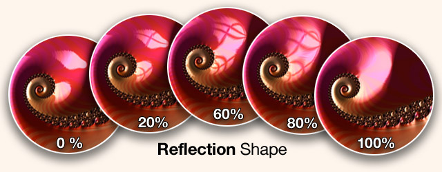
The really interesting part in all this is how the various shapes are affected by blurring, height, gloss and the texture depth… : the outlines change a great deal, and as you slide through the variants of the reflection, you may be surprised how much that alters the final image! Try it…

Tip: in this image of a lacquered surface, the realism comes from the many variations in reflection highlights - just a single round spot would not look anything like it…
So use both lights with difference size, inclination, angle, shine, twist and… shape. Then move things around with the gestures. Try the Lights Shuffle icon - it does change all of those, with every tap - you will find surprising combinations - then fine tune from there.
Pro Geek Tip: a little extra surprise and a pay-off for having read all the way down here…: if you hold the West level 2 Tab "1" or "2" for a few seconds, you will copy all of its settings to the other component.
1 to 2, or 2 to 1… (the same is true for Textures 1 & 2)
That can be really useful - to start off with two identical components and then slightly change one… try it!
The fourth Level 2 tab for Lights is called Tint and it is a bit unusual in that it controls only 4 East tabs, whereas all others have 7.
The reason for that is that each of those 4 has a triplet of Brightness, Saturation and Hue subtabs, so actually Tint is controlling 12 East tabs - but they are symmetrically organized much cleaner in this use of the second level.
Tint in general means: colorize!
The lights used to be monochrome white only, but later we added the ability to tint them much like one could have a white lightbulb and then put filters or gels in front of that.
So each of the two lights can become any color in the rainbow, and additionally there is an overall “ambient” light, akin to general sunlight filling a room, versus little spotlights or lamps with a color bulb inside.
And fourth, the Mandelbrot set interior regions need not be just black either, but can take on any color and brightness here.
Note: The Ambient light is actually called Shadow and is also used in Colors - but only monochrome brightness there. Backdrop is re-used in Global.
The idea for this doubling up is that there you can adjust “all things that affect the MSet” side by side, whereas in Tint you can adjust “all the colorizing effects” all at the same time.
Tip: The simple fact is: colored lights can be quite overpowering! Using a bright purple light will simply drown out any subtle coloring that the gradient may have.
For that reason the shuffling is composed mostly of monochrome lighting, with occasional changes to the Mset backdrop color.
The way to use the tinting is to first make sure you do have Saturation set higher than zero, or else you will not see any color of course.
Then you can move the Hue slider to go through the entire rainbow in 360° steps.
Tip: try it on a monochrome preset like #32
Tip: since these colors are independent of the Gradient colors in the Spectrum and Colors menus, you can achieve really complex and subtle gradations where they are overlapping and mixing!
If a blue and a red light overlap, you will get magenta purple tones, which are then mixing with the gradient in the texture as well.
Also consider that the gradient colors rotate animated, but the light colors move in actual elliptical paths. Beautiful hue changes can be made to animate slowly.
Frax has a very unique look due to several key ingredients. In this image you can see a shape from a basic plain fractal. Frax is adding tuned Gradients and then Textures are used to modulate the colors.
On the left the real Frax with 3D height and lights, a real textured ‘object’ versus that thin flat original…

Textures in computer graphics is a specific term, referring to the surface patterns applied to a shape. Simple examples of textures are wood with its knots and grain, or marble with its veins.
In many programs for 3D rendering there are ways to take photographic images of such surfaces and map them onto objects - but that will not work well with fractals at all : the image above is shown here again - including where it lives as you zoom out…
and the simple cruel fact is: it would vanish within a
single pixel of the larger area, zooming in ranges of over millions to one…
If you zoom into a photo of wood like that - you get just… one plain brown blob and it will be nothing like wood any more..
Of course one could slap a picture of wood onto any given snapshot of the fractal - but you could not zoom in and out as Frax does…
What is needed is a purely mathematical texture engine, which can generate patterns that are self-similar across gigantic scale changes.
This is not that hard to visualize - consider you could draw a triangle or circle ‘from the moon to the sun’, but also ‘from your ear to your nose’, or ‘between molecules’ even (it’s been done ;) and thus these shapes are essentially continuous, without a fixed scale.
And that is exactly what Frax has - a highly complex engine, optimized for realtime generation even in the little phone…
It uses two identical components, with over 30 parameters in total, which are explained in detail in the following pages.
The first tab under Textures All is 3D Height, which has great influence over the appearance of the patterns and shapes.
On the left is a texture without any height, all flat, and on the right with height - which enables all the lighting features. However there is a second kind of height - that of the texture itself. In the center image both are enabled, and the gloss is highlighting the fissures and stripes nicely…

3D Height is actually already covered under Lights All, where it has the same position.
Yes, this is the same parameter being controlled in two places - but for good reason: the height of the fractal is significant in both - the Lights and the Textures. Therefore it is very useful and even necessary to have it as part of the toolset here.
Note: as seen in the image above, there is extensive interaction between the parameters. That also includes dependencies: without 3D height the lights having nothing to illuminate, without Marbling and Height the texture is not visible…
A good understanding of each individual variable will make it quite clear how they all work together and which settings can yield wonderful plasticity and depth, while others are simply non-sensical.
Tip: you can use the Shuffle tab and watch height change with each tap - and examine what it does…
The texture engine is using two components, each with identical parameters. They can be mixed in a variety of ways to produce the final complex texture. Balance is used to control the relative strength, much like a left-right panning knob for stereo audio.
Here you can see the individual textures A and B, which are coming together to produce the complex result in the center:

Note: how the center image is actually combining the two component textures is also governed by the Mix Mode control, covered a few pages ahead.
Tip: Use Balance during the fine-tuning process by moving it all the way left, so you see the first component ‘solo’, adjust it to perfection, then move it all the way right to focus on the second component by itself. In the end you can find the right mixture of both somewhere in the middle…
Note: Balance is also available as an Edge Slider in Explore - the vertical control along the left side. The realtime gestures for Textures are complex and should be used a bit slower - but very useful to see Balance in conjunction with them…
Tip: Use it in combination with the Edge Slider on the right side, Mix Mode. Both together are defining which component is used, in what proportion but also in the method (read more about Mix Mode in the next pages here).
As an example of the kind of creative use you can achieve with Balance, consider this sample image: On the right side you see a snail shell shape with only component A used 100% (the spokes at the center of the spiral). Nice with a simple gloss on it.
But using Balance to add the second component just 3% adds very subtle ridges and they break up the gloss highlight as well, with a bit of color:
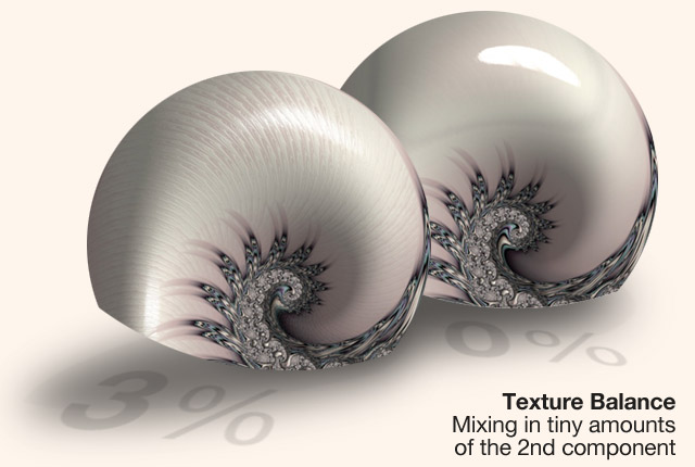
The 3D Height parameter has been covered both in the Lights All and well as here in Textures All: it defines the overall vertical expansion of the fractal as a height field - without it, everything is 2D flat.
But Texture stripes and patterns also have bumps and ridges as well! That is ‘3D Wrinkle’, seen here:

In addition to the overall 3D shape there - the big blobby things - there are smaller features, the lines like brushed metal, which are raised a little bit above the shape - essentially a second height parameter, computed on top of and in addition to the main 3D Height variable.
That texture height is called 3D Wrinkle and can be adjusted here in TexturesAll, as a linear percentage South slider.
Note: In the golden metallic image above you can also see quite nicely that the lights are catching these ridges and accentuate them with glossy edges and shadowy valleys - reducing 3D Wrinkle to zero would create a totally smooth surface. (losing much of the appeal of the gold appearance)
To have another closer look at the way 3D Wrinkle distorts a polished “piano lacquered black”, here is an image showing three settings of this parameter with close-up zooms of tiny areas.
The big shapes are identical, 3D Height set high.
Now lets move 3D Wrinkle:
Here at 60% we have
the full complex texture:
In the middle: 5%
that little bit is enough
to let the texture
come through:
At the bottom: 0%
flat glossy:
Note: there is a reason why the example uses 60% for the “full texture height” setting - 3D Wrinkle is both rather sensitive as well as highly effective:
Moving further to its maximum of 100%, the corresponding area soon looks almost 2D flat again, with the texture itself having a very strong, almost chaotic appearance, as seen here on the right…
Tip: There are creative uses of that drastic setting, (the next pages covering individual Texture controls mention Wrinkle several times) but the basic range for adding the proper amount of height to texture stripes and patterns is probably 3% to 30% - or the high frequency edges can begin to be noisy.
Note: If 3D Wrinkle is set to zero you will only see the textures as flat painted lines (and even that only if there is some 2D Marbling present!)
Note: 3D Wrinkle is also available as a Gesture!
In the Lights mode, ‘two-finger pinch and spread’ is used to change 3D Height, and symmetrically in Textures, the ‘two-finger pinch and spread’ will change the texture height, 3D Wrinkle.
Tip: do play a bit with both “height” variables, since they influence each other quite strongly: you can have very low overall height, with rather high wrinkles, or you can have huge 3D height with just a tiny hint of the texture on it.
Note: the following pages show many creative uses for all Texture features, and both height settings are always a constant part of that - set wrong it can ruin things easily (and all the playing around with the other sliders cannot help to overcome such a basic pitfall).
Do keep them at 20-30% for starters, you can try settings beyond that later, for special effects…
2D Marble is extremely important! Have a look:
a) plain gradient:
wrinkle off, marble off
b) adding a texture:
wrinkle off, marble on
color follows texture
c) texture gets height:
wrinkle on, marble off
color doesn’t follow
d) texture with height:
wrinkle on, marble on
color follows texture
e) All: complex texture with 3D wrinkle height and colors following the shapes nicely… QED
That was a little too brief to really understand all the implications, so to elaborate a bit why 2D Marble is such a central and easily overlooked variable: it is available only once, in TextureAll, a bit in the middle on the fourth tab and named as if it were concerned with just one particular style. One could easily think ‘oh I don’t really need a marble today’ and skip past it. But that would be a mistake ;)
What is really meant by ‘marbling’ is no less than the connection between color and texture!
In the example image, there are ‘the swirly stripes’ defined by the texture, actually just a single component - the second only added at step e)
Important: the bottom line from the above is:
for gradients to follow along these texture shapes, 2D Marble has to be non-zero!
Since this is really a central thing to know, one more time with some close-ups:
At the top here you see: if you add Marble, the colors will begin to follow the texture details - but without Wrinkle it will come out flat.
If you have Wrinkle but not any Marble, you will see the texture with bumped height, illuminated by gloss and shading - but no color.
Once you turn both on - and have 3D height as well - they play together to create the really cool plasticity and depth that are so fun to play with in realtime - and in hi res
Note: 2D Marble has a gesture associated with it, namely in Colors mode, using a two finger swipe vertically up and down will adjust marbling.
It is however sometimes tricky to see exactly what is happening, since it is so very dependent on the texture and the zoom level…
Mix Mode is a ‘meta control’ rather than a variable, and it governs the way the two components
in a texture are combined.
As this example shows, there
are very complex interactions
between the two: you can
see the ‘thin stripes in a
gentle curve’ and on top
those ‘strange thorny shapes’
overlaying the rest… ➔
This is by far not just a mere
‘mix of A and B’. In fact,
that kind of simple crossfade
is done via “Balance”.
Mix Mode is not concerned
with ‘how much of each’
but rather ‘how’ - the algorithm in
the mixing process, such as ‘where
are the thorns versus stripes’ in this…
While it seems a rather long description - it is that for a good reason: with Balance also having three distinct settings, there are nine possible outcomes to combine it with Blending (and that is even ignoring the continuous slider steps in between!)
Several of these nine are very desirable to know and so it is worth a couple pages to go into detail, and a few larger images to show the results.
The three main states of Balance:
| Component A | Mixed A & B | Component B |
The three main states of Mix Mode:
| Minimum height | Full range | Maximum height |
They combine each with each with a unique result - no wonder it can be so easily missed while just playing around… For the Pro upgrade users, this is the kind of deeper knowledge that will make a large difference in designing great fx, and not just shuffle around randomly. Here are all nine with a close-up:


Note: Mix Mode is also available as an Edge Slider in the Textures mode of Explore, the vertical right edge of the screen - and Balance happens to be the north Edge Slider.
Tip: Once you realize the nature of the nine combinations above, it becomes very quick to experiment with each using these two Edge sliders. Never mind the in-between settings, start with the top, bottom and middle on each side and see what happens to your texture…
In order for things to happen, make sure there is some 3D height and a bit of Wrinkle, and 2D Marbling better be ‘on’ as well…
Tip: Once you get past the three fixed settings you find that sometimes it is really nice to pull back just a tiny bit, to allow the second component as a faint backdrop. Such 99% - 1% subtle combinations show up in the next few pages and are the secret to the really balanced great images… :)
The Scale slider under TextureAll is a ‘meta control’ which allows you to change the overall size of features in a texture.
It does that by accessing two variables at once - the frequency setting for Ripple, which each of the components has available a little bit hidden as a subtab. Scale will move both of them in unison.
Note: the Scale slider is expressing its action in terms of “increasing the patterns and shapes” in a texture, so as you move right towards the maximum, things get larger.
The frequency slider under Ripple is described in a more mathematical way: as you move right, the frequency gets larger, but that means there are more of the shapes - and patterns get smaller.
So moving Scale to maximum, you will find the sliders for Ripple frequency have moved to their minimum - and vice versa. But this is merely a semantic issue, they are otherwise identical.
Note: the actual range is an exponential scale, ranging from its minimum 0.12x to the maximum of 8x, several octaves.
Moving Scale under TextureAll the two individual sliders in Texture 1 and 2 are moving relative, not absolute - so if you had them set to 2x and 3x, they would move together, but keep their offset.
However, if you move Scale all the way left you will force both frequency sliders all the way right.
Geek info: Scale is moving the frequency for Ripple, not Stripe. While it is true that Stripe is responsible for the basic elements, they will remain just that, simple stripes, changing in size and orientation and angle and height - but still… stripes.
Only when Ripple is modulating them do actual patterns start coming into existence, and so in order to scale those shapes, Ripple Frequency is the only appropriate target.
Tip: Scale is very handy to see both components change at the same time - it is really not the same to go into component 1, move the frequency for Ripple, while the one for component 2 is staying fixed, then going back and moving 2 a while later.
Everything you see in-between would just be a weird mix of the two.
You will discover that using Scale has a very different feel in your explorations than playing with Ripple individually. Give it a try!
Note: Scale is also part of the complex Texture gestures. It is not the usual simple swipe kind, but a bit more involved:
The Two Finger Rotate gesture is affecting both the Twist and Scale parameters: as you begin it, you will twist the direction - and while doing it you can also spread and pinch to change Scale at the same time. This is different from the plain Spread and Pinch, which are controlling the 3D Wrinkle, texture height.
It sounds more complicated than it is: you just fluidly start with twisting and you can pinch scale while doing that… all in one motion. Useful and fun.
Weave is a cousin to the other meta control, Scale, which you can read details about on the previous page here.
It accesses two of the individual texture component sliders in unison - their Twist parameter. They move together - but out of phase, which creates the crossing ‘weave’ patterns, as the name implies.
Here first an example:
Note: Out of phase means simply: as the Twist slider for component 1 is moving in one direction, using Weave, the one for component 2 will move in the other direction, always symmetrical to another.
So if you move it all the way too the left, Twist 1 will be also all the way left, but Twist 2 all the way right!
Note: A small technical difference: Twist is defining an angle, from -90° to + 90°, with normal = no twist being zero in the center.
Weave however is expressed as a percentage, from -100% to +100%, normal also being in the center and meaning no Twist at all.
Tip: like Scale, you can use the individual sliders for each component one by one, but it is not the same: with Weave you see the two parts at angles to each other - changing, but always in proportion. You’d have to tediously move each one ping-pong, in different directions, to get the same result…
Textures are built by combining two components, A and B (or “1 and 2”), each with more than a dozen parameters, explained in detail over the next pages.
The first tab Amount is like a master volume knob, defining the presence of the component, in percent.
In the example here you can see the top image has those large curves - that is component A, at 100% it is there alone, over the plain gradient backdrop.
Then in the lower image component B is added at a mere 3% - but you can see what a nice difference it makes to have a little bit of structure…

Note: The relative amount of the two components is also controlled by the Balance tab in TexturesAll, which is also the north Edge Slider.
Note: The two individual Amount sliders for A and B do have one unique behaviour: they will always add to a sum total of 100%.
In other words - moving Amount for A will invisibly also change the Amount for B and the Balance as well - go check the sliders, they will have moved ;)
As long as you know that, it is easy to understand and deal with, one should just be aware that there are no settings like “A at 5% and B at 10%”, thinking “I will make a really subtle one”…
Moving A to 5% would push up B to 95%.
Tip: The way to reduce textures is to pull back on their height - 3D Wrinkle - and their influence on the gradient - 2D Marble.
Each component in a texture is using stripes as their basic ingredient. They follow the shape of the ‘stalks’ and ‘spirals’ and such.
Twist is a direct way to affect these stripes: it allows a 360° rotation forcing them to any angle in respect to the underlying shape.
Here you can see the normal lengthwise flow along the spiral arm, at + - 180 they turn ‘across’, at a right angle. Arguably the most interesting effects happen with Twist around the + - 75% mark:
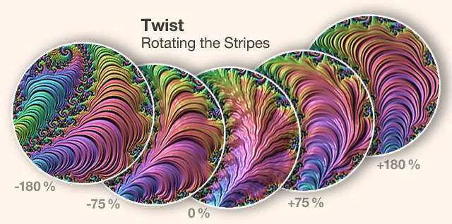
Note: Twist was mentioned in TexturesAll under the Weave parameter, which controls both component twists at the same time in unison, out of phase.
Note: Twist also has its own dedicated Gesture: logically enough it is the two-finger twist. Easier to keep one finger steady and the other rotating.
The third tab for each component, Stripe, is also the first one to have another layer of ‘subtabs’ below: Stripe as a parameter consists of 3 variables to define it - Amount, Frequency and Phase.
Here is Amount in action: at zero there is hardly any ‘definition’ to the stripes, as you go higher, they become rounder, more height and sharper edges…
more depth…
better all
around:
Tip: the actual sweet spot will vary greatly, in this case the highest 100% still looks good - but that can become too noisy often. Try the 20-50% range for starters…
Amount is actually a fairly complex control for the intensity of overtones in the fundamental texture frequency. It adds layered octaves that way and can also be thought of as "harmonics" or "timbre".
Next up lets have a look at Frequency: it has ten steps of multiplying the initial frequency, which will simply add more stripes as you move it higher. In the preceeding example, with an Amount of 30%, it would look like this:

In case you really do want more stripes, how many are appropriate would be very dependent on the current texture, lighting and much else. Just good to know where to do it…
Note: as you can see in the above example, at 5x and higher the features seem to flatten out and become almost 2D, despite having 3D Height and Wrinkle…it is simply the nature of the stripes.
Tip: if there is high frequency noise on the screen, which can look like Moiré effects, you should know that it is quite likely not really there, but an artifact of the low resolution. Once you render a real HiRes file (let alone the Ultra size) you will find almost always that the noise consisted of very fine small details that then become smooth and clean…
Note: the effect of Stripe Amount is of course also tied to 3D Height, Marble, Mix Mode, Balance, etc… you may want to skim over some of the preceding pages in case you wonder why :)
The third subtab for Stripe is Phase: it rotates from 0° to 360° and it changes neither the Amount or Frequency - the number of ridges stays the same, but it “modulates the stripe harmonics”. In other words: as you move the Phase slider, the stripes morph around and catch the colors differently, but keep the same characteristics (and at 180 degrees and 360 you wrap around to the same spot again)

Note: it helps to understand that Stripes are the most basic structure type in the Frax texture engine. The others parameters like Ripple, Swirl and Rake are all modulating these Stripes.
This means that fundamental changes at the Stripe level are very visible and overriding in their effect. It also implies that with Stripe at zero amount or with super high frequencies, none of the other variables are even visible…
If one or more sliders in the texture engine seem to be ineffective, it is likely not a bug, but the nature of the combinations.
Tip: to reset things, e.g. in case you cannot figure out an inactive slider, just load a new factory preset.
Tip: make sure Amount and Frequency are neither zero nor too high, maybe around a quarter of the slider is a safe start (not just for Stripe but almost all texture controls)
Ripple is a modulation of the fundamental Stripe building blocks and has three subtabs for Amount, Frequency and Phase - just as Stripe does.
Using our Stripe example as the backdrop and keeping the Frequency at medium, here is a small area changing as you increase Amount: even at just 5% you start to see the Ripples modulating the stripes, getting longer… and flatter:

Ripple creates secondary distortions of the primary stripes: Amount is obviously about extent and intensity of the effect.
Frequency is what controls the number of the ripple peaks. To see this, let’s keep Amount fixed to medium, and vary only the Frequency instead… ➔
On the right here we see the Frequency slider moving from minimum to maximum and you see the disturbance of the stripes:
soft curves at low frequency and fine zigzags at high frequencies (the top image does have tiiiny ripples!)
The third subtab is Phase and a bit harder to see… it rotates the ripple ‘around itself’ once, using a 360° slider and ends up in the same space as it started - so 360° is the same as 0°, seamlessly.
Phase is really keeping the “look” the same, not more of anything, not stronger, but just where it starts, that is shifted around.
This can be quite handy as you can get many alternate variations - see the lovely curves here:

Tip: You should rotate phase slowly - sometimes even the tiniest degree will produce a different pattern. At higher frequencies the phase changes are less noticeable…
Note: Ripple Phase is also affected directly by one of the Texture Gestures. The Two Finger Swipe will "pan the texture around".
Tip: Remember that in Design the gestures often work on individual components: so if you use Texture All as the West L2 tab, you affect both, while the same gesture with component 1 or 2 selected, will only change that… very interesting to see one fluid change versus the other fixed.
Pro Geek Tip: a little extra surprise and a pay-off for having read all the way down here…: if you hold the West level 2 Tab "1" or "2" for a few seconds, you will copy all of its settings to the other component.
1 to 2, or 2 to 1… (the same is true for Lights 1 & 2)
That can be really useful - to start off with two identical components and then slightly change one, or using the Weave and such… try it!
Swirl is the third Textures function with a trio of parameters - Amount, Frequency & Phase.
It sounds as if it did little else than the Twist or Rotate functions we saw before - but Swirl is really very special: it is kind of the heart of chaos in many textures.
Consider the lovely shape here - it is quite non-linear and irregular, no mere Stripe alone could do this! The secret?
What Ripple does to Stripes, so Swirl does to Ripple!
Three levels of waveforms adding disturbances to the each other, and often it is the tiniest subtle bit that find the beauty - as here!
Swirl Amount is shown here…
In the lower left is the start,
some stripes, bent by a bit
of Ripple - no swirling yet.
Then adding Swirl in an
Amount of 30% you can
see the deformation and
morphing, getting stronger
at 60%, more so at 100%
(it’s the zoom pic from
the previous page!)
As with Stripes and Ripples, the third subtab is Phase, where Swirl also does the same “sliding through the texture space” which is a little hard to explain and visualize.
It is a 360° slider that wraps around, so 360° is back where you started at 0° (which may later be nicely animated some time, however textures cannot quite be realtime yet - use gestures slowly).
Here is how it looks with the example above, a small detail morphing shapes as you slide Phase, note the green line and the lights at the bottom. This is useful as you hunt for a perfect combination:

Tip: in other words, for your general understanding: the texture engine generates waveforms, like sines or triangles, with peaks and valleys. So here is what the three parameters control:
Frequency: how many of those peaks there are
(think sine wave with more and more cycles)
Amount: how tall those peaks are
(sine wave with higher peaks and lower valleys)
Phase: how those peaks are positioned
(sine wave being shifted left right, keeping its look)
This is worth “getting” in general: Phase as a variable will ‘never do anything really drastic’ or destructive, it will not add more peaks or make them larger, it just moves them around.
Amount and Frequency can be extremely chaotic, where a small slider movement totally changes the texture result. Good to know when to be careful.
The last of the actual texture engine “operators” is Rake, and its action is very specific: as you can see here, it is an implementation of the traditional “paper marbling”.
In ‘analog’ you rake a comb through wet paint. In Frax, Rake is another tertiary waveform - like Swirl - that is modulating the Ripple structures and pulling or pushing through, which is a distortion that can look remarkably similar to the paper effect.
However, the nature of Rake is not just about mimicking a narrow effect, but another tool that can be applied in a wide range and create a great number of different results.
Following are a few examples in practical creative use…
In the center here at 0% are yellow and black Stripe shapes, which already have been modulated by Ripple a little bit, hence the ‘undulating curves’. On the left and right you see how Rake is turning
that into stacked rows, and those sharp cuts were introduced with the Rake slider.
You can see the lights catching the edges nicely, very interesting abstract close-ups can be made like this…
Note: Rake requires the Ripple parameter to be there first - and is greatly dependent on its Frequency as well as the Amount. Both together affect Stripe.
Here the setting is taken to another extreme - Ripple at higher frequency is used to make closely spaced Stripe lines and then Rake adds the deep cross-cut channels, leaving fun “tube worms” behind, that fill the stalks and spirals endlessly…
Tip: this is also a little example
of cutting out portions of a
Frax image and then adding
a bit of shadowing etc,
to make it ‘a little object’
to include as an ornament
or other design ideas.
This also shows
how the lights
and shadows
are bending
properly
around the
curves and
crevices…
Rake is capable of very different kinds of effects
Being dependent on the frequency of Ripple, it comes out quite unlike ‘paper marbling’.
At the bottom you see Rake adding the soft curved ‘trenches’, while on the right it cuts very deep to create whole new sculptured forms…

Please see the Mix Mode page under Textures All.
Global is the last West tab and incorporates a number of general parameters that can be adjusted directly. The name is a bit of a catch-all-category, combining several unrelated variables with the common theme that they change overall settings that affect the entire fractal.
Note: Some of these have to do with the same features that fall under “Motion” in the Explore interface, and therefore the active gestures during Global are those from Motion - panning, zooming, rotation. In further symmetry to Explore Motion the Shuffle tab randomizes the global location.
Note: Three of the East tabs under Global have another Level 2, with further sub-options, leading to eleven parameters in total.
The first East tab under Global is the precision slider version of the two finger gesture in Motion: Global Rotation of the entire fractal.
It spans a full 360° circle, and the South Slider is using the center position as zero degrees = normal, with either direction rotating the whole Mandelbrot or Julia set to -180° to +180° degrees.
Note: you can use the two finger rotation gesture while the Global west tab is selected - you will find a change reflected in the South slider for Rotation…
Tip: it is quite rare to need exact numbers for the fractal position, since its orientation in space is rather arbitrary. However, it is quite handy to have it in such cases as wanting to show the Mandelbrot set zoomed out exactly horizontal, or vertical. Using the gesture to do that, you will often find that it missed the true straight line by a few degrees +- and you can then use the Rotation slider to fix that.
The second tab under Global has quick ways to change the orientation of the fractal: Transform has a second level with three tabs to perform single actions (and therefore no South slider)
These are FlipV, FlipH and Rotate 90° and they do pretty much exactly what the name implies…
Note: Rotate is of course part of the Rotation slider, as well as the gesture. It is included here because in conjunction with the horizontal and vertical flips, it allows you to get to all possible straight line positions with just a tap or two.
Note: The Mandelbrot set (and for every point on its parameter, the matching Julia set as well…) is inherently symmetrical.
Any point on the right side has a matching one on the left, the horizontal flip does that…
Tip: The reasoning behind even wanting to perform any flips is that you may find it interesting to change certain shapes in your image.
A simple example: say you have a few - or a zillion -spirals in there, for which you have that sneaking suspicion you would prefer them clockwise, rather than counter-clockwise… easily done.
These are the four variants just a tap away:

Surely one can flip the final render in Photoshop, but it is much nicer to be able to have the real fractal change its orientation and later save it as a preset in that correct way.
Note: Moving manually over to the symmetrical other side is actually trickier than it may seem, since you could be zoomed wayyy deep - and thus having the Flip function is very handy.
The third tab is a simple toggle switch, but it has gigantic repercussions: you are doing nothing less than switching to a parallel universe!
In all seriousness - the deeper theories can fill entire books (and have) but to explain enough to make sense of it ‘just within Frax’, read up on a bit of the Fractal Sciences.
As far as this toggle control, here are some of the basics: “MSet” stands for Mandelbrot Set, that rather famous shape which Polish born French mathematician, Benoit Mandelbrot invented - or should one rather say discovered - in the early 1970s.
It looks initially a bit like a “jagged circle” and of course the main feature is: as you zoom-in to investigate the edge, new details appear, in principle an infinite number on its circumference, as well as an infinite number of further levels of depth!
Frax is all about exploring these shapes and forms and figures, both zooming into them, and at any given level of depth, rendering as much detail as can be displayed (of course given some limitations of CPU speed & RAM memory on mobile devices)
The key point to understand is: you are usually seeing merely an utterly tiny segment somewhere deep within the Mandelbrot set, just a billionth of it or less, and yet, as infinite as all of those are - they still all belong to the MSet.
Note: The images rendered at any level may look random, but there is actually nothing “random” about them at all: the same set of seed numbers will reproduce them exactly, every time…
One would think that “infinite” number of variations ought to be enough for a lifetime or two of exploring - but the fact is: self-similarity is one of the inherent properties of it, and so after a while you begin to recognize the various shapes…
There is a vocabulary of forms, probably many hundreds at least, but not the kind of infinity one intuitively associates with that word. Rather more like “no two strawberries look exactly alike” - so there are infinite variations of them - but it would lose a bit of its excitement after a while…
But - as infinite as all that is… it is merely one of many other possible universes like that!
In fact it gets more amazing still: for every single one of the infinite number of points along the edge of the Mandelbrot set, there is a matching other shape - and that collection of all of the infinite sets of them is called the Julia set.
By the way, just like the MSet being named after its discoverer Benoit Mandelbrot, the Julia set is bearing the name of the mathematician who first published their existence - and he did so over 50 years before Mandelbrot: Gaston Julia.
(Independently Pierre Fatou worked in this domain)
On a noteworthy aside: Julia wrote his thesis right during WWI, where he lost his nose at age 23 - and had to live with various leather straps across his face - but still lived another six decades, with six children as well. Amazing work by an amazing man… on many levels. (Just checking if you folks really rtfm, are you?)
So in a way, the Mandelbrot set is really more a kind of map of the infinite set of Julias and being able to see those in addition is a major expansion of the possible spaces and shapes for Frax.
(If your first reaction is ‘why add to an infinite number? Who could ever tell?’ - think of it rather in the above analogy: in addition to all strawberries, you could have infinite raspberries as well, which do taste quite different ;))
To do the switch between Mandel and Julia sets, there is a whole separate module called “Shape”, which you may have found by now (as part of the Frax Pro upgrade, it is under the menu when you tap the logo…)
Shape focuses on nothing but this conversion and explores the many shapes and possibilities with lots of examples. (You can switch to the page for Shape right now)
In addition to the dedicated function there is also a simple quick switch available here under the Global menu - with two Level 2 tabs allowing a ‘direct hop’ from the current MSet to the equivalent Julia set - or the other way round…
There are many subtleties to this “universe switch” - and many wonderful possibilities and unexpected results…do not overlook this part of the help pages, you can find spaces that no one has ever been at…
Tip: Just to point out one direction: as you zoom into the classic MSet, you do realize after a while that there are many small copies of the set shape found inside itself, at deeper zoom levels.

You guessed it - they are infinite in number really, but already after zooming in a mere 10x or so, one can find thousands of them, quite fast… (for instance following the long tip, they line up)
These so called “Mini Mandels” are copies of the full set, rotated, scaled - some are exact detailed twins, other with softer edges, some morphing towards circles and sometimes skewed at angles in amusing distortions…
Geek Tip: When you are zooming around the Mset, it is quite easy to find MiniMandels (in the top 'needle' area alone there are quite a few readily visible, but along all the edges they come into view just a few zoom steps in…)
Thing is: Frax has a built-in library of over 10,000 of the largest MiniMandels and as you find one of them, a little message will pop up for a second saying "Mini Mandel #8145" or similar…
One could actually do neat little games around that, imagine hiding something in a certain spot ;)
Geek Tip: When you use Shuffle (in Motion or in Global), you are switching to new locations each time. Some of them are centered on MiniMandels with especially nice fields surrounding them - such as zillions of tiny spirals. Once you have a MiniMandel in view, the next Shuffle will go… to another MiniMandel! So you can hop around from one to the next for quite a while ( well, at least over 10.000 times ;) and see how they differ. Quite interesting to see the crooked tips, the bulging skewed bodies, and especially the drastically changing fields around it! If you decide you are all minimandeled-out… just swipe to pan to the side a little, and Shuffle will continue in the usual way.
Here is one example of where such things are hiding… and a fun skewed off angle one as well…
You can see in the lower left the zoom beginning, into the sharp needle shape and how the final big white MiniMandel differs from the main one:

Note: a much more in-depth treatment showing which Julia formations live in the corresponding Mandel spots can be found in the pages on the Shape tool…
Tip: Now the insight…: if you do know that certain spots on the MSet generate interesting Julia shapes - say the fourfold symmetries at the tip of the tail end - you then realize: the same is true for the smaller Mini Mandels - they too produce these results in what is often termed “nested Julias”.
But as the Mini Mandels are surrounded by other areas, and not identical but rather morphed cousins of the main set - so are the nested Julias interesting deviations and mutations…… and great fun to explore!
Note: in theory one can go even to higher level nesting - i.e. a MiniMandel inside a MiniMandel inside a Minimandel (or more…you guessed it…) - and then the equivalent nested Julia - however, the self-similar nature limits how far the shapes can still escape to any completely new and different classes of forms.
Frax has to make a compromise between the depth of zoom levels and limited precision in order to maintain the fluid zoom and pan. Ultra Deep zooms do require exponentially more computation.
The fourth tab under Global is Contour, essentially a choice between alternative coloring algorithms, i.e. the way the color gradients are applied to the fractal shape.
Here a quick illustration of the principle - in the center, small monochrome, the plain shape to fill.
Version “A”, left, is a bit like “fill along the shape”, versus “B” right, “fill concentric insets to the shape” but nothing in everyday language quite fits here.
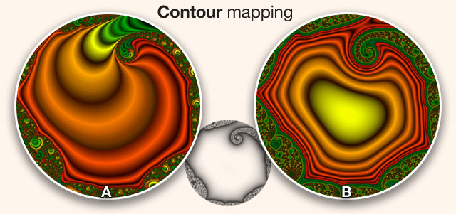
Note: One can certainly see the drastic difference given a gradient that makes it clear like that, but with low frequency or blurred gradients, it is much less obvious what mapping is used.
To explain it a little more in depth: Every point surrounding the fractal can be colorized either by counting the number of iterations, ‘A’ above and the first of the subtabs options. Or it can be computed by estimating the distance, ‘B’ above and the second subtab called “Euclidean” style. The difference is denoted in the respective formula using the greek letter Phi φ.
As the somewhat geeky math labels on the subtabs imply, it can get a bit involved here - but without delving any more into higher mathematics than necessary, let us focus on the creative uses and implications of the two choices given…
Note: Contour is an entirely different and unique function, unrelated to all others and in particular for one reason: almost everything else in Frax is a continuous change, which can be interpolated smoothly between all states (aside from the color and position ‘flips’, which could still be considered ‘in the same space’).
And so it does represent a real binary split - either one method - or the other. It is one of the very few discontinuous jumps like that in all of Frax.
Let’s just look at them both and learn to like each one for its own charming differences… :
Note: It is hard to say that one would be ‘better’ than the other, they each have their unique character. One important parameter that plays into this is 2D Marble under Textures All: it will distort the gradient to not only follow the shape, but in addition follow the texture forms as well. This obviously has great impact on the way the colors are applied.
There are benefits to each mapping, consider for instance this example, which shows one of the implications of the Euclidean ‘concentric’ mode: the same part of the gradient is always touching the edges across the entire fractal - this allows a very sharp delineating in a contrasting color.
It is almost like a stroke outline that can sharpen the edges. With Color Frequency you control the spread of the Gradient, and with Phase you then move the right portion to become the edge… This could not be done with the ‘normal’ mode ‘A’:

On the other hand, here is an example of something not possible with Euclidean.
The shapes below are filled along the entire shape using a spectral rainbow gradient. You can see that each of the little pillow objects has only one color, the gradient scaled across a large area. In Euclidean there would not be “a red object”, since all colors of the gradient would be used in the inset contours, so the entire spectrum towards the edges…
This is certainly a nice reason to use mode ‘A’ :

Tip: the image above shows a neat use of Frax: you can extract shapes and have them float on a background, casting a little shadow…
It is elementary Photoshop really, but just to make sure: there is no point in actually "cutting them out manually" with a selection tool or wand (due to the recursive areas it would get immensely fiddley and take a long time).
Instead: Save the same fractal twice: once in the fully formed way you like it - with colors, lighting, textures, etc…
Then go to Spectrum and choose Gradient #1 - which is a plain monochrome grayscale from black to white. If you use a bit of Contrast you can create a harder edge - and now it is a matter of the interplay between Frequency and Phase to fill the shape in such a way that "what you like is black" and "what you need to cut off is white" (or vice versa, easily switched later.)
You are thus making an "Alpha channel", a mask, which you can load in Photoshop (or many similar programs) and in one second - plopp, you have extracted the shapes, just like in the image above.
Another way is to color the backdrop Mset as such an alpha channel, e.g. purple to extract it easily later - mentioned on the next page for Backdrop.
There are endless uses for such things: they can be ornate borders around a page, or irregular edged frames around pictures, but also more involved: moving alpha channels to fade between two video sequences in an unusual way.
You can also always send us special ideas like that - fun to see how Frax gets used.
There are three more parameters under Global that affect the way the actual rendering process itself is carried out - as opposed to variables like lights, textures or gradients.
The first of these is somewhat arbitrarily called Backdrop, and it is simply the main color of the interior of the Mset. If the inside area is white, the look is quite like “ink on paper”, with a black backdrop, the shapes are more “glowing objects in deep space”

Tip: once you are aware of the possibility you can simply check during your fine tuning if the fractal looks nicer against a dark backdrop, or maybe rather lighter…
Backdrop has a second level with three subtabs, the trio of Brightness, Hue and Saturation, with which you can create any color variation.
Backdrop is also available in the fourth L2 tab for LightsAll - which has all the Tint options for colored light sources.
It is not strictly a "light" per se, but one can think of the Mandelbrot Set itself as ambient-lit (i.e. 'in all directions').
The advantage of the Tint menu is that all four colored light options are available side by side for quick changes.
Tip: another possibility is to use Backdrop to align the color with the features. With Euclidean contour mode you can make the backdrop color the same as the edges for a seamless result.
Tip: You can also extract shapes by making the Backdrop color an alpha channel in Photoshop which becomes transparent. You can make great borders and ornaments from fine fractal forms.
The tab “Detail” gives you access to a very important parameter in the rendering process: the number of iterations performed for each pixel before going on to the next…
In other words: you are setting the precision with which the edges are more and more finely computed iteratively.
At the top here you can see the maximum of 2048 which shows the exact Mini-Mandel shape and finely detailed filaments around it, which begin to soften at 1024, then at 512 there is just a blob, and as you lessen the resolution further from there, only coarse outlines remain.
The range of this number in Frax is a minimum of 128 all the way to a maximum of 2048. Stopping earlier will result in points at the tips and edges of the shapes being ‘cut off’, as it were, or the overall appearance having less detail - hence the name…
Note: it should be fairly obvious that performing 2048 iterations is a lot more than 128 - but also that doing that per pixel - on the 4 and 4S iPhone over 600,000 times - this difference will really add up ;) So there is a trade-off in speed versus precision.
Tip: on the other hand, the lower setting is not just there to ‘zoom a little quicker’ - it also has a real creative function: the lower precision will change the ultra detailed shapes into more “blobby” ones, which can actually be very interesting…
Here an example.. : these alien stalk things are not within the normal space of Mandel or Julia, they get their odd form by being truncated via Detail:

The last tab under Global carries the unusual name “Filigree” - which could have probably been “Detail”, if that had not been used already.
Its function is quite straight-forward: it controls how far the thinnest tiniest features on the tips of the ‘stalks’ are visible - or not… those thin little filaments visible on the outside of the Mset, but most on the inside of the many features once you start zooming in deeper.
Tip: the extent to which the tips are being colored -matching the value set with Backdrop - is fairly limited, it is not infringing on the gradient, really. But it is very useful in eliminating the highest frequency portions, which can sometimes take on the appearance of noise…
Filigree is a quick way to clean up your final image, making the innermost areas solid and smooth.
Here is an example - in the center is the original - which was made with the Filigree set to some arbitrary value, like 20% here. In the center of the spirals you can see the black body color visible - alas, it is a bit fuzzy, the edges not clearly defined.
On the left Filigree was moved to 0% - which fills in the area completely (in this case) and on the right at 100%, the black color is maximized and filled solid, either way it is much cleaner, the noisy edges either solid black or gone entirely…

Note: the left solution, filling in the fractal area, may not always be possible using just Filigree, since it only enhances the very deepest edges and only a small amount.
Tip: Consider you can also use Backdrop to lighten the black to a grey value that matches the inner edges - here among the light blue a light grey might work fine and become equally flat and clean.
Tip: The solution to create a more solid black inner detail is limited to a reasonably small expansion inwards - but you can use the Detail parameter and lessen the overall precision, which will also fill in more of the body color… - but it will begin to swallow up detail and make the tiny swirls more blobby. Read up on Backdrop and Detail for more info.
Tip: Since you may not be able to predict reliably how Filigree may act, just make it a point to try the min and max settings during your “polishing” phase and just see what you like. It can surprise you ;)
Tip: Filigree is also the West Edge Slider when you are in Textures mode.
Gestures Overview
Frax is using multi-touch gestures to play with the Mandelbrot and Julia sets in realtime. It even switches between multiple sets of these gestures…
Tip: If you missed the Intro Videos showing this in under 20 seconds each, you can find them here…
The four main buttons (Motion, Colors, Lights and Textures) use the gestures to allow instant changes, each in its own appropriate way, over 20 all together. Surely you figured out a lot just by playing around, but there are some really good trips and tricks! Let’s jump right in:
Single Finger Single Tap
It is the most basic control - the unsung hero:
If the interface is shown then a tap gets rid of it.
If the interface is not shown then a tap brings it back.
Single Finger Single Tap also stops the animation, which can be any combination of movement, colors or lights - whatever is active will be paused.
The play and pause icons on each button allow you to start and stop individually - the single tap pauses them all together. Once stopped, use the icons to start each one again - where they left off - or continue gesturing…
Tip: while you zoom and pan and rotate etc, Frax has to constantly re-render the current visible area. If you are interested in a final clean still image, use a single tap and just let it go. All computation will be used to generate the full quality image, usually in a few seconds, depending on the zoom depth.
Note: if you have animation going with no UI visible, but you want to change modes and need it without interrupting, use the single tap at the very top or bottom 10% screen edge, it will bring up the interface while continuing all motion.
A single tap also stops Tilt.
Note: there is a wide difference between the various iOS devices some have faster processory, more RAM, better GPU, and often also more pixels…
So it should be a common sense reminder to state the obvious: the optimal speed at which one can execute the gestures depends heavily on that computational overhead and complexity…
In other words: try to find that perfect speed for your device and the mode you are in, and have a lot more fun than just swiping around wildly…
Color Phase and Frequency are much easier and thus faster, changing more then ten times per second… while the Texture gestures are doing some extremely heavy lifting - (Geek note: and are more CPU-bound, versus things that can be done in the GPU). The Lights are somewhere in the middle.
So: for Texture in particular, move a bit slow and steady, see how the morphing shapes are evolving.
Gestures Motion
• Motion (the first button in Explore)
This is where all navigation within the fractal is done, via multi-touch gestures. The gestures are used here more than anywhere else - it is the central point of exploring the space, and you can combine them all at the same time!
Single Finger Swipe
Probably the most basic gesture. Here it means “panning”, like pushing a large sheet in all directions to see what lies beyond the screen edges. You are really changing two numbers, the x and y center coordinates.
Note: as you swipe and then let go, the movement continues on its own, animated. You are scooting the sheet in a direction, and it will keep going at the last speed you nudged it with. There is no friction, so it will just continue (a single tap stops it).
Note: the speed is defined at the moment you let go, which can be quite fast, actually. There is an additional control via the South Edge Slider covered a bit later here: swiping along the bottom edge it can change the speed for all animated things at once, when in Motion. (The same South Edge Slider affects the respective animation speed for Colors and Lights in those modes…)
Note: as soon as you are moving animated, the tilting function becomes active. See a bit further below under Tilt.
Note: in Design you have access to all the Motion gestures when the 5th tab “Global” is active.
Two Finger Pinch and Spread
This pair of gestures is the obvious and well known zoom-out & zoom-in function, as in photos or maps.
Pinch moves areas from the outside inwards, so you are effectively seeing more and are further zoomed-out
As you let go, you fly all the way to the final full set, either the Mandelbrot or Julia, framed in a Frax logo.
Spread moves areas apart and opens new space, so you are zooming in closer.
Note: the speed will stay steady once you exceed the fastest level, to stay smooth and render nicely.
Tap Zoom In and Out
As an alternative to the continuous gesture there is also the method used in Apple’s map app (et al).
Double tap with one finger quickly and you will get a fixed zoom-in.
Unlike the Spread gesture the tap zoom does not trigger an animated motion afterwards - it purposely only works once.
Single Tap with two fingers is the matching opposite: zoom back out.
It goes the fixed distance as well, without animation afterwards.
Note: Both Tap zoom-in and out are meant to be exact repeatable steps, as opposed to the free form “flying” of the Pinch and Spread gestures.
Each of them moves exactly 3x. For example if you zoom way out, so the M-set covers a third of the screen and then do one tap-zoom in, it will then cover the full screen, 300% larger.
Note: if you use the spread gesture to fly animated deeper and deeper, you will at some point reach the limit that can be computed with 64 bits of resolution (“double precision”). If you zoom into too close into the texture, a hint will pop up to tell you to Pinch zoom back out a bit.
Two Finger Rotate
This gesture is also used with photos and other apps, should be quite familiar. Sometimes easier if you keep one finger fixed and move only the other.
In Frax it rotates the entire image in realtime, which is often handy to align shapes or to frame your fractal.
Note: In Pro there are also the Flips and Rotate 90° controls under Global.
This gesture also works like Swipe and Pinch: as you let go, it will continue the motion in animation.
Tip: the really unusual and interesting part is that you can combine all of them! With two fingers down, you can push a little, rotate a bit, and slightly spread them apart to also zoom in, creating a wonderful combined swirly dance or spiralling!
Tip: just in case you missed them, or only saw them once on your first run, the videos show all the gestures live, in just 15 seconds. See them here…
Gestures Tilt
Tilting
This one is not so much a multi-touch finger gesture, as it is… the whole device!
Tilting becomes active as soon as you have animated motion and it is really nice!
Definitely worth getting a bit used to and then employing it as a valuable tool in your arsenal! (it is not just a cheap flight sim)
So if you hold your iPhone or iPad - it does not matter at what angle - and then you swipe and let go… you will see the fractal scoot along by itself, at the speed with which you last left it. Same with spreading or rotating…: let go - and it will continue on its own (including any combination, see above).
As soon as it does that… Tilting is active!
Just try it… make it scoot, spin or zoom… and then just Tilt: change the angle at which you are holding your device!
Tip: you do not have to grossly ‘yank it around’ between vertical and horizontal… just tiny changes will work very nicely, just a few degrees, really.
Note: Frax calibrates the tilting so the current position is taken as normal - which causes no changes - and then further alterations of the device angle are detected and used to influence motion.
Tip: In order to get the hang of this, start with your device flat on your hand, horizontally straight.
Now tap the Motion button and swipe a bit, slowly, and then let go: your fractal should be scooting along happily… And now you can change the way you are holding it, just a little bit, forward tilting, or back towards you, “as if you are rolling a little ball around on top of the screen”. Slowly still at first until with a little practice you can “steer it around”!
Note: the tilting will change your panning speed and direction - as you angle it forward, things will slow down and come to a halt, changing the angle towards you it will gain speed again. You can move faster or slower, alter the direction or come to a complete stop, all in one continuous tilting motion!
Note: tilt will act as a directional “steering” control while zooming as well, however it will not affect the zoom speed as it does the panning speed, since that would probably be just too many varying parameters at once.
Important: always remember that a single tap will stop the tilting motion (and all other animation). If you have just a little bit of residual panning going on, even the tiniest amount, it will force Frax to constantly recalculate and rerender.
Since there is no separate “tilt button”, remember to tap once and it will continue to render to full precision and beauty…
Note: There is one more interesting use of Tilting, and that is in the Shape map and Deep Zoom. While you are tap zooming into the cross-hair pixel exact, Tilt would remain off. But it is very nice to use a very tiny subtle angle and see all the Julias dancing around changing wildly! More under Shape
Important: some people expect “a forward tilt” to move the frax forward, as if you are steering a little ball on top of the screen, which then rolls away from you with gravity. Funny enough, about half the people expect it exactly the other way round!
If the tilting motion somehow feels wrong to you, or you just cannot get the hang of making the fractal move as you expect, you can flip the tilting direction! Under the general iOS ‘Settings’, if you scroll far down you find Frax listed in the app section: in the preferences there you can switch the Tilt Direction.
Gestures Colors
• Colors (the second button in Explore)
The gestures covered so far were all to do with navigating in the fractal space, with Motion as the active button. As you switch to Colors, all of them take on a new meaning, appropriate for the tasks…
You can read a lot more details in the many pages about the Design > Spectrum and Colors controls, here just some thoughts regarding the Gestures.
As you probably know by now, Frax uses a 512 step complex “Gradient” to colorize the shapes. The main gestures interact directly with it.
The Single Finger Swipe moves the gradient along, technically called “rotating the phase”. Effectively this is “pushing the colors” along the stalks.
Tip: if you see real shapes, spirals, blobs, stalks etc try to touch right on them first - the color will move right under your finger, ‘sliding on the surface’.
Important: Swipe is the single gesture in Colors that creates the animation, all others are momentary (unlike in Motion, where all of them continue).
The speed with which you move and then let go will determine the animation speed.
Once animating, you can use the South Edge Slider to change the speed afterwards. Nice to achieve extremely slow movement for instance.
Tip: with Swipe in Motion there is a maximum limit to how fast all the new information could be generated. In Colors there is basically no such barrier - it is so fast that you can flick the gradient at ridiculous speeds… just try it!
The two gestures Two Finger Pinch and Spread are also affecting the gradient directly. While in Motion they were zooming in and out of the structure, here in Colors they are also doing a kind of zoom - but instead into the gradient itself!
Technically it is changing the Frequency parameter under the Spectrum tab in Design. You can read more details there of course.
Shown here in “N” is the normal gradient, which starts adding more colors and repeating at higher frequency as you use Pinch (A B C), or you zoom further into just a subsection and see fewer colors at lower frequency (1 2 3), as you use Spread.

The fourth gesture in Colors is also affecting the gradient directly: Two Finger Rotate will do as the name implies: rotate - in this case the Hue.
Note: with a rainbow gradient like above one can get a little confused how Swipe and Rotate both seem to do the same thing. However, if you have a gradient that consists only of blue and white, Swipe will rotate the phase - just move ‘blue and white‘ repeatedly - while the 2 finger gesture rotates the hue - i.e. you can turn it to ‘red and white’ instead. It also stops moving as you let go, no animation.
More details on the pages for Hue.
Tip: you can swipe to animate the colors at the same time as all the motion animation, just switch the mode, or use the play/pause icon. More details on the Animation page.
Tip: many of the presets show color animation effects. You can load them to examine closer.
Gestures Lights
• Lights (the third button in Explore)
The gestures have completely new tasks once you switch to Lights. And they are very powerful here. So much so that you actually cannot do with the direct sliders what you can do with the gestures!
Consider the basic One Finger Swipe which only controlled a single number in Colors, the Phase. Here in Lights however, it actually controls four variables all at once, in realtime:
There are two light sources in Frax, and each has a full set of sliders for intensity, gloss, shine, reflection shape and such. And each also has a specific 3D direction, analogous to the sun: you set “how high” in the sky it is, from 0 to 90°, also called ‘Incidence’, as well as from what angle, in 360°.
There is much more detail on this in the pages on Lights All and Lights 1 & 2, definitely worth reading and understanding more, if you have fun with Frax.
Tip: it is a little tricky to visualize what the plain swipe gesture actually does in Lights. After reading more about it in the pages on Incidence and Angle it may help to think of it also analogous to a pendulum: if a light was hanging down from the ceiling on a string, and you pushed it a bit at an angle, it would follow a curved path and return back on another curve in an elliptical closed motion. In fact, if you push it totally towards the side, the string would keep it from going there and instead travel in a large circle once around.
That is in a way exactly what you are doing with the one finger Swipe in Lights, except you are doing it to both lights at the same time! They stay relative to each other as they were, and move in ellipses.
The only difference is that additionally they also travel up and over the fractal, shining down, as opposed to hanging from the top, as if they are lights moving on the surface of a half sphere focused on the center. Read more under Incidence.
The really fun part is that all this complex dual pendulum motion is animated : give it a nudge and they keep going indefinitely…(all that while color phasing, zooming, panning, rotating and tilting!)
Tip: there are many many more subtle possibilities with the simple swipe in Lights, some are suggested in the pages on Angle. Strong relief sidelighting with the darkest shadows for instance, can be made to rotate slowly all the way round without getting over the fractal and becoming brightly lit (the trick is to scoot near the bottom sideways…)
Tip: do watch the video on Lights again…
Tip: a really cool thing to do is to move and let go, so both lights are animating.. and then use the Shuffle icon in Lights repeatedly: each time you get a whole new set of ALL parameters, tuned as a set, and see what that does to your fractal - and you will be surprised at the huge variety of effects!
The other gestures in Lights do not animate, but they are extremely important for the overall appearance.
The Two Finger Pinch and Spread is changing a single parameter: 3D Height.
The key to understanding why it is so powerful to alter this using a gesture is that it fundamentally influences how the lights will catch the shapes of the fractal, how much sheen or sharp gloss they have and more.
With a Pinch you are doing just what would happen if you pinched something like a tablecloth: you are crumpling it up, making it bulge and add height.
Tip: you can see drastically what happens if you Shuffle through light sets and keep using Pinch to see the effect it has on ALL the parameters, such as very slight height spreading all the highlights, and tall height making tiny sharp gloss reflections!
The remaining Lights gesture is Two Finger Rotate which will actually not so much ‘rotate the light source’ (if you think of a stage flood light) but the reflection shape.
Note: It can be a subtle but nice way to fine-tune the lighting in your fractal. More on this in the pages for Lights 1&2 Twist.
An additional gesture is available that is actually not controlling the Lights, but the general Brightness coupled with Gloss: the Two Finger Swipe.
If your fractal seems too dark overall, you choose to use either Shadows - the left Edge slider - or this gesture, Two Finger Swipe vertically up and down, to lighten things…
More on the dedicated page for Brightness.
Gestures Textures
• Textures (the fourth button in Explore)
The first thing to mention about Textures is that they are very much more complex than any of the other three modes. There are two components which have a total of over 30 parameters changing their structural design.
Relevant to Gestures this means there is no animation, since all the others are allowed to be freely mixed in parallel and adding Texture would currently break the speed metaphor.
There are gestures, and they do work in realtime, but they will not continue on their own after you stop moving.
Tip: this also implies that you should use a slighter slower speed when gesturing in Textures. Once you move at the right pace, it will feel perfectly responsive and not lag behind, but do not treat it like you could Color Phase for instance…
The basic Single Finger Swipe is actually the most complex in Textures, as it is changing many parameters at once.
The Textures are composed of two components, each of which has a triple nested system: the basic Stripes are modulated by Ripples, which are in turn affected by the Swirl and Rake parameters.
Swipe in the horizontal axis is affecting the Scale of the two components, so at Min the features are smaller and at Max larger - but: it does it to both components at the same time, and out of phase! So one will get larger while the other gets smaller and vice versa! Interesting effects can happen…
Swipe in the vertical axis is controlling Weave which in turn affects the Twist rotating angle for both components at the same time, out of phase. So one set of stripes will rotate clockwise, while for the second component the stripes rotate counter clockwise.
You can tell there is a LOT going on there…
If you move in circles or at a diagonal, you will change four settings at the same time, which is a very different process than trying to move four sliders sequentially.
Note: both Weave and Scale are globally affecting both components, even if the selected West tab is 1 or 2.
Tip: slow and steady does it. Really fun things can happen… but it only alters what is there.
If there is hardly any texture or you happen to be in a location where you see mostly the background, these gestures will seem to have little or no effect.
Tip: good fun to use Shuffle and get fresh textures, (zoom in to an area to see them properly up close) and then use the Swipe gesture each time - you get a huge variety of changes and effects…
Similar to Lights, the Two Finger Pinch or Spread gesture is changing height - however it is not the overall 3D Height of the entire fractal, but the amount that the texture itself is raised above and below it, called 3D Wrinkle.
You can think of it as an Orange: the Texture height is like ‘the bumps and dimples on its surface’, where as the 3D height reduces it to… just a sphere ;)
The effect of using 3D Wrinkle in combination with 3D Height can be extreme - it will totally alter the appearance of the fractal, and also interact strongly with the lights, which emphasize the shapes with glossy highlights along the texture features, and dark shadows as well.
Tip: using too much texture height can look noisy (although that will clean up nicely at Ultra render size) Start with a tiny amount…
Tip: Do read up on the help pages for 3D Wrinkle.
The Two Finger Rotate gesture in Textures is a direct cousin to the way that the Swipe is modifying the Stripes and Ripples.
You are changing the “Twist” setting for each of the two components at the same time, and out of phase: they are 360° angles, one rotates clockwise and the other counter clockwise.
Tip: the vertical Swipe is also affecting Twist, but the 2 Finger Rotate does respect the 1 and 2 tabs setting, so you can twist only one while the other stays fixed.
Note: remember the interaction of 3D Wrinkle, the texture height, with 3D Height and Marbling - in some settings gestures will show little or no effect.
Note: do read more in the pages on Textures.
There is an additional gesture not used in Motion, and a bit rare: the Two Finger Swipe.
Each component is composed of Stripes as the basic structure, then modified by the other effects.
Each Stripe in turn has Amount, Frequency and Phase controls - and you are now rotating only the Phase through 360°.
The Phase does not really alter the overall texture, it kind of “rolls it around”.
Tip: unlike the plain swipe, this gesture is respecting the 1 or 2 tab setting and will affect only one component in that case. So you can move one texture around while the other stays fixed, then switch and do it the other way round :)
Animation
Frax is using many gestures to initiate self running animated motion and effects.
They are covered in detail in the help pages for each parameter, as well as additional information in the specific help section on Gestures.
Find the exact pages here:
| Single Finger Swipe | Panning |
|---|---|
| Two Finger Spread | Zoom-In |
| Two Finger Pinch | Zoom-Out |
| Two Finger Rotate | Rotation |
| Physical Device Angle | Steering for all Motion |
| Single Finger Swipe | Color Phase Cycle |
|---|
| Single Finger Swipe | 3D Position for 2 Lights |
|---|
Edge Sliders
There are multiple parallel metaphors used in Frax to solve certain challenges in appropriate ways.
One of the tasks is to allow quick access to those parameters that benefit most from real time changes but allow seeing the entire image at the same time. The obvious method is usually multi-touch gestures, which Frax is utilizing extensively - over 20 of them!
But there is a limit, how many can be remembered, before it becomes simply absurd.
So an additional 12 variables are accessed through a very simple idea: invisible controls called Edge Sliders along all four edges of the screen, which wake up upon touch (with a momentary label to remind you of its function…)
In the example image we are in Colors and the left edge as been touched and a downward motion has set the color amount value to zero.
The label shown, “Saturation”, will only flash gently for a second and then fade, leaving the entire image in full view, except for the tiny slider itself - and even that is transparent ;)
So the only spot escaping your view is the little triangle “knob”, and that is moving ;)
Note: unlike ‘normal sliders’ you do not have to try to “grab that little knob exactly” - on the contrary, you can start anywhere and drag anywhere, just ‘grossly in the rough vicinity’, so to speak.
Don’t think of them as ‘precision settings’ where an exact data value is needed - it is much more an intuitive… well… Gesture, which happens to work off the location rather than detecting which fingers are used.
Tip: it is much more along the lines of thinking “a little more color would be nice, maybe make this a tad brighter? Should I rotate the colors more towards red? Let me see what Light 1 and Light 2 are each doing? The shadows are too dark, can we lighten those?… ALL of these and many more are what the Edge Sliders are about!
Once you get the hang of it, you can use the combination of full screen Gestures with the Edge Sliders to adjust three dozen detail parameters in realtime - without any interface visible whatsoever!
The key is that they are not dumbed-down, inexact ‘play things’ at all, but shortcuts to real variables with real numbers and real controls, which CAN be set individually, learned and understood that way - and then appreciated as power-short-cuts for the experienced user!
For that reason Edge Sliders are not in Basic Frax, but are added to “Explore” with the Pro upgrade.
Here is a quick listing of all available Edge Sliders:

Tip: just play - they will quickly be unforgettable ;)